The ThinkingWithPortals Map Showcasing Thread
Quote from WinstonSmith on June 27, 2011, 1:41 pmInspired by the "Map Pimpage Thread" on mAL, which was in turn inspired by other threads.
Show off what you're working at the moment! Making a map that you don't want to release as a WIP? Don't want to make an entire thread to discuss your map before you release it (which you shouldn't do anyway, for the record)? Post some screenshots in this thread and discuss others.
A few notes:
--Try to keep your screenshots at around 700px wide maximum, probably a bit less; not only are smaller images easier on load times, they actually fit on the forum view for most people.
--Linked thumbnails are nice but certainly not required.
--Be open to suggestions/criticism from others.
--On the above point: if you're going to provide feedback make it constructive. Don't pull an "OMG thos lazors suck and look ulgy", instead say "Good sir, I do think you might want to align the front of that laser with the wall. Cheerio."And remember...
Inspired by the "Map Pimpage Thread" on mAL, which was in turn inspired by other threads.
Show off what you're working at the moment! Making a map that you don't want to release as a WIP? Don't want to make an entire thread to discuss your map before you release it (which you shouldn't do anyway, for the record)? Post some screenshots in this thread and discuss others.
A few notes:
--Try to keep your screenshots at around 700px wide maximum, probably a bit less; not only are smaller images easier on load times, they actually fit on the forum view for most people.
--Linked thumbnails are nice but certainly not required.
--Be open to suggestions/criticism from others.
--On the above point: if you're going to provide feedback make it constructive. Don't pull an "OMG thos lazors suck and look ulgy", instead say "Good sir, I do think you might want to align the front of that laser with the wall. Cheerio."
And remember...
![]()
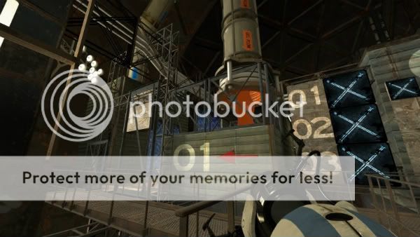
Quote from KenJeKenny!? on June 27, 2011, 9:04 pmJust a small preview of my new map(Lost in Testing #2). It's basicly just the entrance right after you exit the elevator but im gonna try and continue with this style. So it's like a sampler
Just a small preview of my new map(Lost in Testing #2). It's basicly just the entrance right after you exit the elevator but im gonna try and continue with this style. So it's like a sampler ![]()
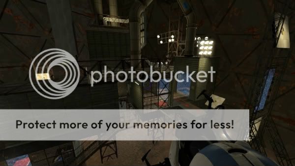
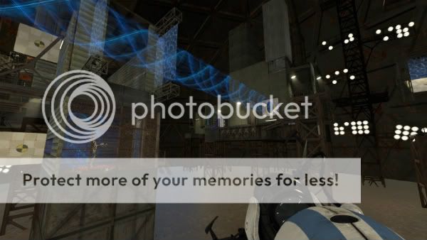
Quote from Marlovious on June 27, 2011, 9:56 pmA few shots from my upcoming "Marlow's coop Underground"
-I'm looking for competent testers. PM me if interested.
A few shots from my upcoming "Marlow's coop Underground"
-I'm looking for competent testers. PM me if interested.
Quote from Marlovious on June 28, 2011, 7:42 amNacimota wrote:Water looks a bit odd in that last shot, Marlovious; pretty nice apart from that thoughYes, I still need to finish off the details of the lighting and props.
Yes, I still need to finish off the details of the lighting and props.
Quote from Will T. on June 29, 2011, 12:38 amI have a functional two-room, laser-based chamber, but I'm sort of holding off on any sort of release until I can work out a third puzzle to complement the first two as what's there feels pretty short and simple for a complete release.
I also have what is currently a "just-for-fun" aesthetics-based project. If I ever produce enough maps to assemble into a mini-campaign, this is where the player will start:
It even has a nice vista of the antechamber before it, where test subjects arrive by elevator:
There are full-size versions of these here, if anyone wants to see them bigger.
I have a functional two-room, laser-based chamber, but I'm sort of holding off on any sort of release until I can work out a third puzzle to complement the first two as what's there feels pretty short and simple for a complete release.


I also have what is currently a "just-for-fun" aesthetics-based project. If I ever produce enough maps to assemble into a mini-campaign, this is where the player will start:

It even has a nice vista of the antechamber before it, where test subjects arrive by elevator:

There are full-size versions of these here, if anyone wants to see them bigger.
Quote from ChickenMobile on June 29, 2011, 1:25 amI've never seen an old aperture lobby done before. That might turn out interesting.
I've never seen an old aperture lobby done before. That might turn out interesting.
Quote from KenJeKenny!? on June 29, 2011, 5:43 amchickenmobile wrote:I've never seen an old aperture lobby done before. That might turn out interesting.I have to agree that looks really good! you gotta use it!...
Maybe have the waiting room look like its vacant for some time... and then have the wake up sequence run...as if you just got up from the floor after being out for a while...
I have to agree that looks really good! you gotta use it!...
Maybe have the waiting room look like its vacant for some time... and then have the wake up sequence run...as if you just got up from the floor after being out for a while...
Quote from WinstonSmith on June 29, 2011, 7:40 pmHot dang those antechamber screenshots look good Will. Keep it up, I am definitely playing when you release it.
Hot dang those antechamber screenshots look good Will. Keep it up, I am definitely playing when you release it.
Quote from Will T. on June 29, 2011, 7:52 pmWinstonSmith wrote:Hot dang those antechamber screenshots look good Will. Keep it up, I am definitely playing when you release it.Thanks!
I can't 100% guarantee a release, as any map pack it would be a part of is only an idea right now. I don't know that I'll ever really produce a complete map pack (I certainly won't officially announce one until it's well underway), but I'll likely include this if I do. I built it as an aesthetic exercise for now.
Thanks! ![]() I can't 100% guarantee a release, as any map pack it would be a part of is only an idea right now. I don't know that I'll ever really produce a complete map pack (I certainly won't officially announce one until it's well underway), but I'll likely include this if I do. I built it as an aesthetic exercise for now.
I can't 100% guarantee a release, as any map pack it would be a part of is only an idea right now. I don't know that I'll ever really produce a complete map pack (I certainly won't officially announce one until it's well underway), but I'll likely include this if I do. I built it as an aesthetic exercise for now.


