The ThinkingWithPortals Map Showcasing Thread
Show off what you're working at the moment! Making a map that you don't want to release as a WIP? Don't want to make an entire thread to discuss your map before you release it (which you shouldn't do anyway, for the record)? Post some screenshots in this thread and discuss others.
A few notes:
--Try to keep your screenshots at around 700px wide maximum, probably a bit less; not only are smaller images easier on load times, they actually fit on the forum view for most people.
--Linked thumbnails are nice but certainly not required.
--Be open to suggestions/criticism from others.
--On the above point: if you're going to provide feedback make it constructive. Don't pull an "OMG thos lazors suck and look ulgy", instead say "Good sir, I do think you might want to align the front of that laser with the wall. Cheerio."
And remember...


Nacimota wrote:
Water looks a bit odd in that last shot, Marlovious; pretty nice apart from that though
Yes, I still need to finish off the details of the lighting and props.


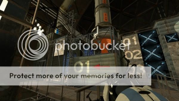
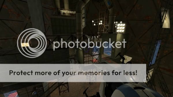
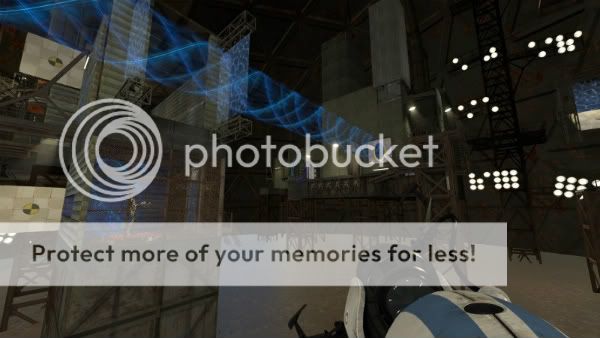
I also have what is currently a "just-for-fun" aesthetics-based project. If I ever produce enough maps to assemble into a mini-campaign, this is where the player will start:

It even has a nice vista of the antechamber before it, where test subjects arrive by elevator:

There are full-size versions of these here, if anyone wants to see them bigger.
chickenmobile wrote:
I've never seen an old aperture lobby done before. That might turn out interesting.
I have to agree that looks really good! you gotta use it!...
Maybe have the waiting room look like its vacant for some time... and then have the wake up sequence run...as if you just got up from the floor after being out for a while...
WinstonSmith wrote:
Hot dang those antechamber screenshots look good Will. Keep it up, I am definitely playing when you release it.
Thanks!  I can't 100% guarantee a release, as any map pack it would be a part of is only an idea right now. I don't know that I'll ever really produce a complete map pack (I certainly won't officially announce one until it's well underway), but I'll likely include this if I do. I built it as an aesthetic exercise for now.
Will T. wrote:
I built it as an aesthetic exercise for now.
Heck, if I were you I'd make a map pack completely out of those.
Taught myself how to get these bad boys to get working in my own ghetto way.
a.jpgEven though its only intended for the maze to be solved by the bomb, i added different responsed for other objects getting scanned in the maze.
It is composed of a "facade" model from the turret factory, the scanner model and the faithplate.

And also there is bts area, where you will get to know t the gravity machine.
It
s all part of a campaign Im working on. I have 7 maps so far and I plan on having at least 20, if not 30.

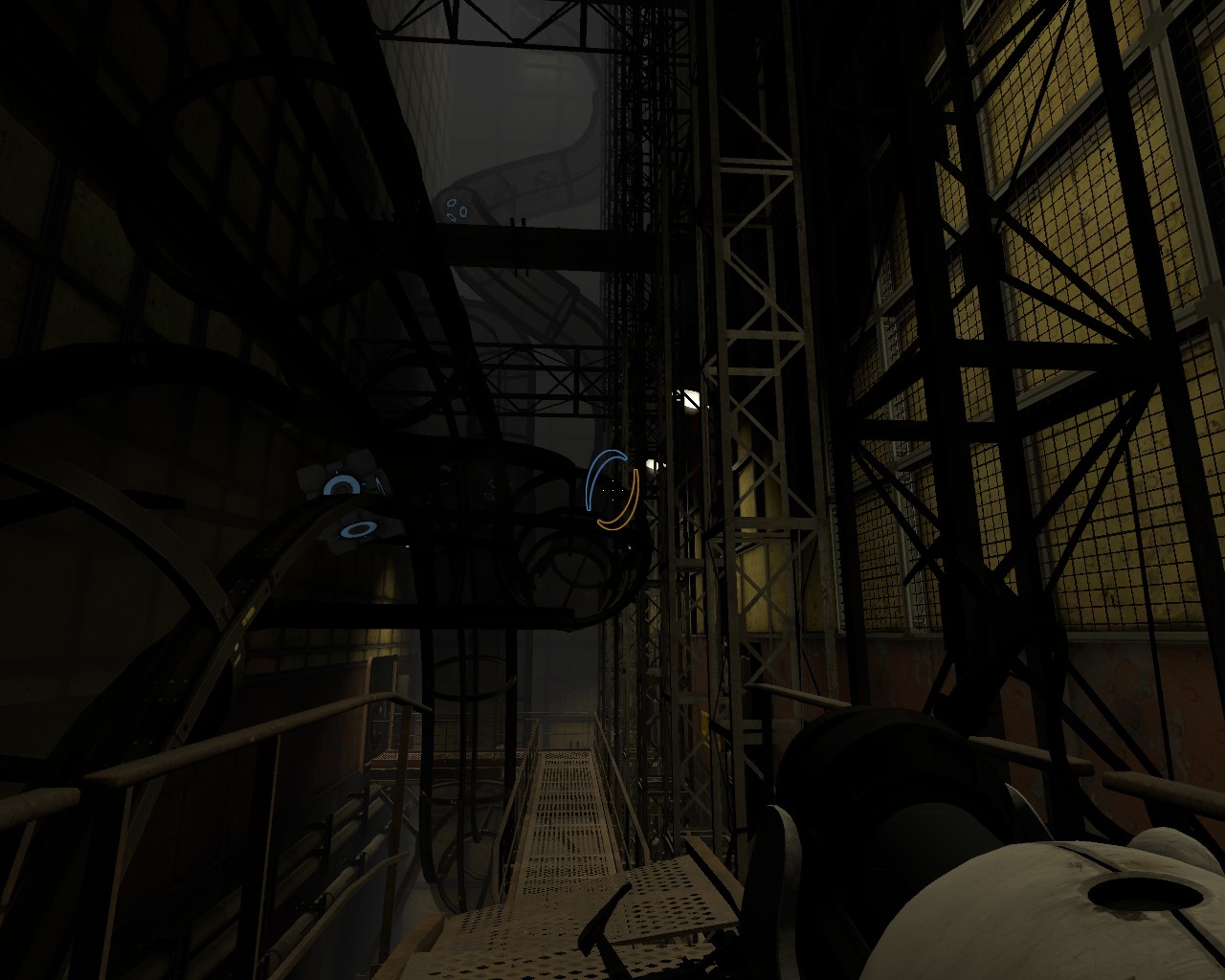
Yes, I'm working on the lighting at the moment, as I'm not happy with it... Probably the hardest bit I think.
baca25 wrote:
Taught myself how to get these bad boys to get working in my own ghetto way.
a.jpg
Ahh you fixed it? 
I see some promising things in this topic, looking forward to test them all 

I haven't got a name for the map yet, but I've been working on it for quite a while now. The puzzle I'm still working on, but it mainly involves use of the two gels.


This is my first attempt at a full-on map for Portal 2 (or the Source engine for that matter!), and let me simply say that I've been loving it the further you get into it 

Robdon wrote:
ThanksYes, I'm working on the lighting at the moment, as I'm not happy with it... Probably the hardest bit I think.
I actually think that the lighting is almost perfect as-is.
Usually when something is broken or shut-down, there's typically a red warning light that turns on, and I think that it's an interesting new look for a test chamber.


