[WIP] Glass Prison
Quote from Artesia on October 17, 2007, 12:38 am11-11-08 - Obviously I haven't been working on this in like a year, its on the back burner
I enrolled in college and sort of lost interest... I'm looking into maybe working on a TF2 map... testing out my idea atm...
UPDATE: beta release on page 4!
Original Post:
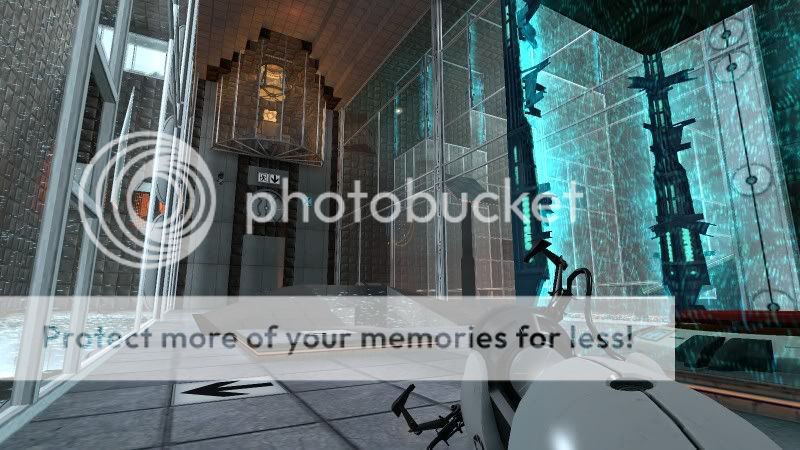
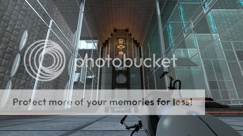
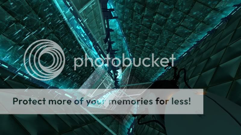
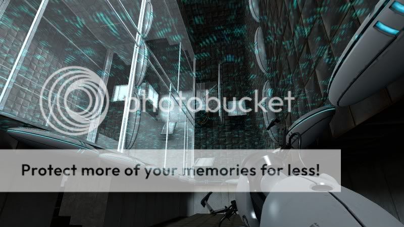
thought Id post some pics to show my progress on my map.this is the first map ive ever done, so bear with me.
I haven't tweaked with the lighting yet, haven't built cubemaps, and the puzzle is only half done. and I've used combine shields in place of the fizzle particle effect until it is released.
let me know what you think
11-11-08 - Obviously I haven't been working on this in like a year, its on the back burner ![]() I enrolled in college and sort of lost interest... I'm looking into maybe working on a TF2 map... testing out my idea atm...
I enrolled in college and sort of lost interest... I'm looking into maybe working on a TF2 map... testing out my idea atm...
UPDATE: beta release on page 4!


Original Post:
thought Id post some pics to show my progress on my map.
this is the first map ive ever done, so bear with me.
I haven't tweaked with the lighting yet, haven't built cubemaps, and the puzzle is only half done. and I've used combine shields in place of the fizzle particle effect until it is released.
let me know what you think ![]()
Quote from msleeper on October 17, 2007, 12:39 am

Please do not Private Message me for assistance. Post a thread if you have questions or concerns.
If you need to contact the staff privately, contact the Global Moderators via Discord.
Quote from Spacemonkey on October 17, 2007, 12:43 amlooking really nice
looking really nice
Quote from Artesia on October 17, 2007, 12:44 amwell I keep making it more complicated...
I'm designing it to challenge myself...
For instance, in order to test a new leg of the puzzle, I have to move the info_player_start because the puzzle is designed so that you have to do everything sequentially, with little to no pauses. so if you mess up it resets. If I didn't move the start for testing, it would take a long time to test it because I would have to get everything before it perfect to even get there... lol
Also I keep adding new ideas, I'm going to add a combine ball puzzle to it, which originally wasn't planned.
If you look at the right side of the first screenshot, you see other glass walls like those one the left, but its completely empty over there, I haven't gotten around to building that stage of the puzzle...
I felt I needed to post something, as others are already releasing maps. I spend a lot of time working on texturing (which is only in placeholder stage at this time) and fine details. I want to map to look awesome
well I keep making it more complicated...
I'm designing it to challenge myself...
For instance, in order to test a new leg of the puzzle, I have to move the info_player_start because the puzzle is designed so that you have to do everything sequentially, with little to no pauses. so if you mess up it resets. If I didn't move the start for testing, it would take a long time to test it because I would have to get everything before it perfect to even get there... lol
Also I keep adding new ideas, I'm going to add a combine ball puzzle to it, which originally wasn't planned.
If you look at the right side of the first screenshot, you see other glass walls like those one the left, but its completely empty over there, I haven't gotten around to building that stage of the puzzle...
I felt I needed to post something, as others are already releasing maps. I spend a lot of time working on texturing (which is only in placeholder stage at this time) and fine details. I want to map to look awesome ![]()
Quote from Karkk on October 17, 2007, 12:58 amLooks really nice, just try to keep it somewhat linear so that you always know sort of where to go. Because I think most people don't like trial and error maps where you have to try everything twice in order to know where you're supposed to go.
Looks really nice, just try to keep it somewhat linear so that you always know sort of where to go. Because I think most people don't like trial and error maps where you have to try everything twice in order to know where you're supposed to go.
Quote from roger federer on October 17, 2007, 1:07 amsometimes figuring out what to do next is part of the puzzle.
sometimes figuring out what to do next is part of the puzzle.
Quote from Artesia on October 17, 2007, 1:18 amthis is more of an obstacle course,
as you can see in the first picture, as soon as you enter the room, you see first the button, then the door, lastly the cube up high in a glass observation room.
then on the left, is a square hole in the glass, with overlays of a 1dice dot, with an arrow pointing to the hole, right next to that is a pit you can use for thrust.
it is extremely linear, but sometimes you have less than a second to realise what you need to do and to do it, before it resets. but then you can take another go at it.
this is more of an obstacle course,
as you can see in the first picture, as soon as you enter the room, you see first the button, then the door, lastly the cube up high in a glass observation room.
then on the left, is a square hole in the glass, with overlays of a 1dice dot, with an arrow pointing to the hole, right next to that is a pit you can use for thrust.
it is extremely linear, but sometimes you have less than a second to realise what you need to do and to do it, before it resets. but then you can take another go at it.
![]()
Quote from Karkk on October 17, 2007, 2:39 amroger federer wrote:sometimes figuring out what to do next is part of the puzzle.True, however I'd prefer seeing a puzzlerooms goal quite quickly after a look around and then figure out how to get to it rather than having to first figure out which one of 5 ways I'm supposed to go. I think that with good level design figuring out where to go can be quite fun but personally I can feel very overwhelmed if I start on a map with holes and buttons everywhere without any hints as to where I'm supposed to go.
True, however I'd prefer seeing a puzzlerooms goal quite quickly after a look around and then figure out how to get to it rather than having to first figure out which one of 5 ways I'm supposed to go. I think that with good level design figuring out where to go can be quite fun but personally I can feel very overwhelmed if I start on a map with holes and buttons everywhere without any hints as to where I'm supposed to go.

