File Size: 5.71 MB
Downloads: 845
Rating: 2.5 (18 votes)
Description
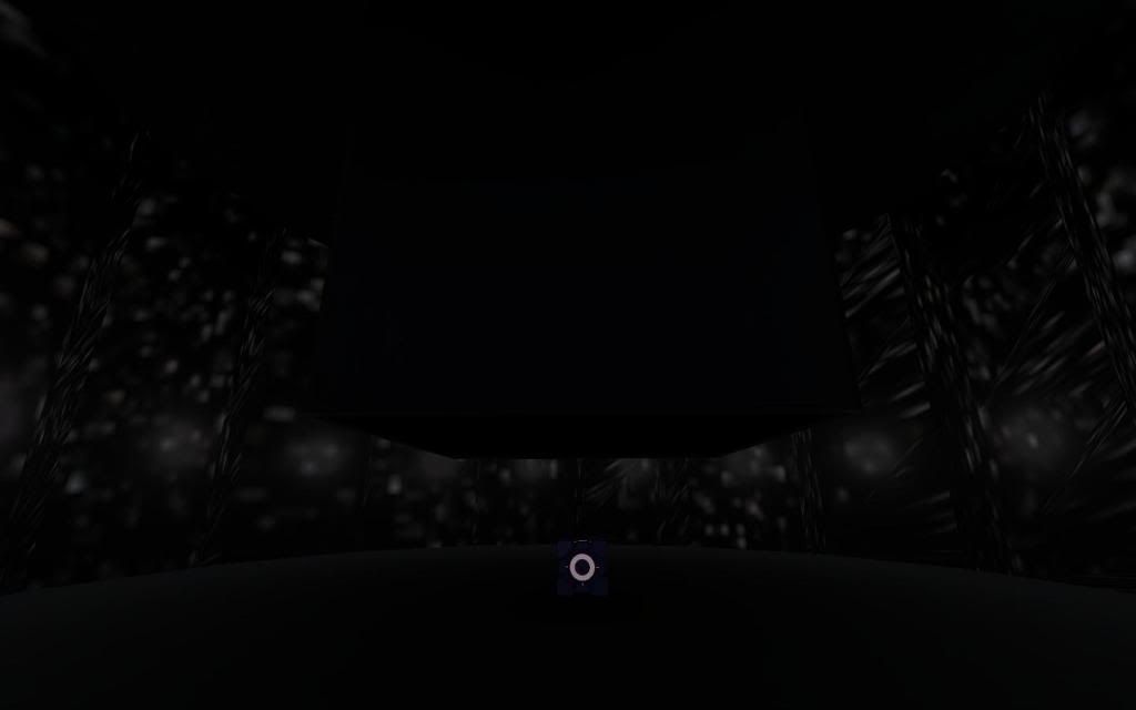
Inspired by the Indie game of the same name by Cactus and Every Day the Same Dream by Molleindustria, this map tells the story of an Aperture Science employee who gets trapped in his own dream. Instead of puzzles, this map focuses more on exploration and finding different ways to go than the path laid out in front of you.

Comments
Sign in to comment.
 ehhhmmmmm crazy map. i thought every moment somthing was going to scare the hell out of me. but nothing came. ehm and there is no end? you always get to the start where the cube is again!?
bad thing is, my frames drop to 15 fps. thats very strange!!??
The point of the map is to break away from the path that leads to nowhere and find the way out. There is an end, trust me. From what you said, you haven't even begun to solve the map yet. Keep exploring and you'll find out what to do.
I have no idea why your framerate drops so low, however. The map runs just fine on my computer...
I see. I meant to make it dark like a bad dream, but if people are actually having trouble seeing I'll turn up the brightness a bit (or maybe you should, if it's not up at least half way).
I compiled the map in HDR (High Dynamic Range), which I adjusted all the lighting for. Without it, though (and I'm not sure if it's something that the client can turn on or off in their graphics properties or if people with crappy graphics cards don't use it or something like that), all the lights are wonkey because I didn't set their LDR brightness.
Is that the only problem you have? I know how to take criticism, and I just want to know why my map sucks or rocks if someone says so.
And good god, man, is your avatar even allowed?!
well i like the idea, but im thinking that you have to be on LSD to play this map! hehe i have all colours aktivated ( i think) but still when i go to the last room i end up at the start. and people with epilepsi wont play you map i think! hehe
other thing is that this is portal, people normaly want to solve a puzzle using portals. you could do this mape for a halflife 2 mod, but i miss my portal gun and thats mabe why people get bored. but i dont know 
If you have all the colors, you shouldn't be able to get to the "last room". Keep searching and look at the small details. Also, why would this be bad for epileptics? Are you talking about the blinking light in the office? Because that's there for a reason...
And yea, the main reason I didn't have a portal gun is because I found I can't come up with very good puzzles using one. I instead decided to take a different route and have a small story clearly based on portal but without portals (Valve was actually considering this when they were developing Portal 2, in fact). That's why I said this map is based more on exploration than puzzle solving.
Regardless of overall quality, I'm quite proud of myself for making and releasing this map. I learned so much in so little time (compared to how much time I thought it would take to learn all that I did) and I can use all of it to make my next map much better than the last.
i mean the colours are to brite and to intence, i dont know how the map looks on hdr, but at my settings its to shiny, the yellow and the greeen hurts in the eye. nothing about the concept, its a very cool idea to have like a maze where you have to find and see every corner. but at the end i got bored and i cliped true all the rooms to get to the last room. is it the one with the love cube and the trees? where the whole background begins to move and make you dissy?
i think turning the lights up some more would help alot! try something with timetravel next time, thats so awseome!!
Potential cult map, oneiric and psychedelic. But not yet: at best, it's still an infant WIP which can't yet balance its shortcomings.
Let's drop the preliminaries: I'm into this kind of indie, artsy stuff like Hazard: The Journey of Life or Sutef (wtf is "Cactus and whatever"?). They succeed because they are not only mind provoking, but also beautiful if minimalist. Complainers who don't "get it" are bound to come, inevitably, and you need something sexy to back your position: it can't both play AND look like crap. You need to strenghten the map.
Because honestly, we're doing this for the weird surprise effect: anybody would drop a "normal" map, featuring that pitch black corridor 10 times. Make this fun and pleasant, in your map's best interest without entering the "me against the brutes" frame of mind when they ask for better quality.
There's your lightning.  Take a look at someone else working on your same premises:
Unique Styled Map
It takes mad skills to make something stylized and looking good. If I may suggest, you might be better off working on a more surreal version of the current "secret rooms": think Silent Hill. Small note: the azure pit can be walked over with ease, should be wider.
Sutef: http://rottentater.com/sutef/
**Hazard: The Journey of Life http://www.udk.com/showcase-hazard
Dammit, those aren't supposed to be pitch black!
If you type "buildcubemaps" into the console and then "mat_reloadtextures" and "mat_reloadmaterials", those pillars should look much better. I don't know how to get it to do that by default, however.
Thank you so much for your critique, though. I'll see what I can do to make this better!
Good one! Check the site chat on Steam, you might find other mappers to help you fix that issue. Smart people are always receptive. 
I tried typing those things in the console and still everything is pitch black. I'd really like to finish the map. Any sugs?
It's not required to finish the map; it just makes the pillars stand out from the black.
Keep looking around and you'll find the answer. I made it so that places that are no longer useful seal off, so don't be afraid to double check somewhere you've already been.
I have been stuck trying to find the second to last room for an hour, the only rooms I can get to are the color room, black maze room and the room with 4 windows. There is no office just goes back to the color room. I don't get it?
Figured it out, I like the subtle hint. More light would help, you really don't need to hide anything with dim lighting.
I wanted the map to feel really dim because some dreams are dark like that. However, I can see that form is starting to interfere with function, so I guess I'll just have to make it feel like a dream in a different way. That said, I am definitely going to make the map much brighter. In fact, I'm redoing the maze entirely and I think you'll like how it looks once I finish it...
Thanks again for your input!
I am a fan of these types of art-house games, however yours is really dark, too dark in fact to even play successfully, almost pitch black, half the time I could not see in front of my face and is probably the reason I did not finish it. You have a cool idea, however, it needs work. I hear you are updating the lighting which is probably the best thing you could do. I would also think about adding a bit more direction for less frustration.
speaking of art-house games, have you tried any of these?
tedium (very much like Everyday the same dream)
dear esther (becoming standalone game later this year)
radiator series
increpare a whole bunch of art games
Hey Yoshermon, wouldn't you like something as that Unique Styled Map?
Unique Styled Map
What do you mean by "less frustration", magicrat? Or, more specifically, which parts frustrated you?
And I did try that Unique Styled Map, xdiesp. It has a pretty cool concept, but there's not a whole ton that I can learn to apply to my own map aside from making it brighter.
Depending on how bad of a case of procrastination I may or may not get, I should have the map updated either later today or tomorrow.
I have all the colored lights except yellow 
Based on what I've seen so far, you want the player to collect Red, Orange, Yellow, Green, Blue, Indigo, and Violet; and then White is probably the final achievement
Any hints for yellow? As far as I can tell, there is nothing else to find in the fizzler maze. And the "office" room just blinks when I walk into it, and leads me back to the start.
I can't help but notice a very dimly lit door a ways above the "office" door, visible in the fizzler room, but I can see no way to get to it.
matrixbandit wrote:
Any hints for yellow? As far as I can tell, there is nothing else to find in the fizzler maze. And the "office" room just blinks when I walk into it, and leads me back to the start.
I never liked those windows, so deep underground with their sterile, cold "artificial daylight". One of these days, I would think as I passed by. If I only had a hammer...
Quote:
I can't help but notice a very dimly lit door a ways above the "office" door, visible in the fizzler room, but I can see no way to get to it.
That's the door you come out of when you first fly into the maze. I'm going to fix that too.
Ideally, as shown above, I would love to have some words appear onscreen in various places giving the character's thoughts as you play through his dream. They would definitely help lower the frustration factor and give the level a bit more meaning, I'd imagine. Unfortunately though, I haven't figured out how to get game_text to work and people say that it's finicky anyway, so I'm a bit hesitant to experiment with it. If someone has a (preferably simple or easy to implement) way to show text on screen via a trigger or the like, I'd really like to know.
Also, where in my map is it too dark? Is it just the maze room, or is there anywhere else that caused you to go mat_fullbright?

Why thank you!
But again, I must know which parts are too dark. The maze I have covered, but is there anywhere else that's annoying or hard to stand being in?
Can't remember: was the all-colours room dark, in the beginning? If so, that's another one: but probably, they mostly mean the maze - remember that you haven't released the updated version of it, yet. Also, I didn't mention yet that the all-colours room gets progressively heavier performance-wise, as coloured lights increase.
Idea: you could have the player wake up on the bed at start, and then go to sleep at the end.
AAAAAnd updated! I'm pretty sure I've got the cubemaps to work this time, but if they don't then please tell me. The maze should be a lot easier to see but a lot more confusing anyway (you'll see why...), the hallway you start out in is brighter so it's not so hard to find your bearings, and just some general bugfixing you guys suggested. Please let me know what you think now!
omg i finished it, it took me absolutely forever but i finished it, 5/5 really creative
Gah, look at the way those stars are looking on my pc:
http://i212.photobucket.com/albums/cc12 ... -11-23.jpg
Really, really bad stretched.
Absolutely brilliant - and somewhat mind-bending. It was a bit frustrating for the bit where you have to smash the window in the corridor off the maze room - I had tried a couple of the other windows first with no result and assumed none of them would break.
xdiesp wrote:
Gah, look at the way those stars are looking on my pc:
http://i212.photobucket.com/albums/cc12 ... -11-23.jpgReally, really bad stretched.
I don't know how to fix that, to be honest. I've messed around with the texture but nothing seems to make it look better. I'm just glad the cubemaps actually show up for people now.
Other than that, however, do you think this version is an improvement over the last?
Not with that texture all stretched out... Either you fix it somehow, or it's back to full black which at least seemed more radical than buggy.
Well, thank you for your thoughtful and in-depth critique on all the many other aspects of my map. It's wonderful to hear all of your many thoughts and feelings about the changes I've made and suggestions to help make my map even better, and your gentle encouragement really keeps me going. 
Wouldn't you make a video, to see how you see those stars? I don't think you're seeing what I see, it's really hard on the eyes here.
Are you talking about the "ripples" in the reflections? Like near the right of your picture, do you mean those diagonal streaks? It looks the same on my computer, but I don't know what's causing it! I used the metal_lift001 texture on the walls because it was reflective, but it also had scorch marks on it. I stretched it out on those walls so they wouldn't show, but that's not what's causing the problem because I made a whole new texture that was the exact same save for removing the scorch marks, and I applied it evenly on all the brushes but I still get those weird ripples in the reflection.
If it's the brushes themselves that's causing the problem, I'm afraid I can't do anything about that. I didn't make that room on the grid, so if I change the walls I'm going to have to completely redo the entire damn thing, which will be extremely tedious and that will be betting on the hope it's the walls' fault here.
I appreciate the help you gave me at first, I really do, but if all you're going to do now is bitch about a damned texture then I'm going to ask you to stop, because I'm doing all I can and it doesn't seem like that big of a deal to me anyway.

I quit. I've been through every color mentioned here. Now all I have is the white room opened with the cube, and the hallway with four doors. I've taken the cube into the hallway, to no effect. One of the least pleasant experiences I've had playing custom maps. 2/5 from me.
Note to self: This map was at the top of p. 11 on 1/27/2012. I'm not really keeping up with it, am I?
This map is very different, but for some reason I liked it. Here is my blindrun:
Dp-3FAsnsmY
(Link: http://www.youtube.com/watch?v=Dp-3FAsnsmY)
Inspired by the Indie game of the same name by Cactus and Every Day the Same Dream by Molleindustria, this map tells the story of an Aperture Science employee who gets trapped in his own dream. Instead of puzzles, this map focuses more on exploration and finding different ways to go than the path laid out in front of you.
File Name: Psychosomnium.zip
File Size: 5.71 MiB
Click here to download Psychosomnium - Updated