The ThinkingWithPortals Map Showcasing Thread
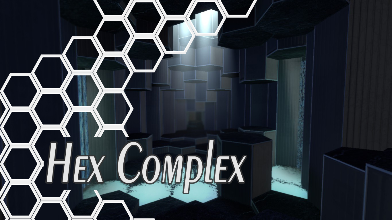
Just a spooky portal 2 map I was working on, lighting effects are cool too (thanks tmast)
I didn't have much time to do anything interesting today so I decided to post some pics of this.
http://steamcommunity.com/sharedfiles/f ... =383186066
http://steamcommunity.com/sharedfiles/f ... =383186162
http://steamcommunity.com/sharedfiles/f ... =383186145
http://steamcommunity.com/sharedfiles/f ... =383186154
http://steamcommunity.com/sharedfiles/f ... =383186132
http://steamcommunity.com/sharedfiles/f ... =383186122
http://steamcommunity.com/sharedfiles/f ... =383186106
http://steamcommunity.com/sharedfiles/f ... =383186093
I hope to actually finish this one well and make it worth releasing here, cause it hopefully will be better than those crappy noobish horror maps on here, plus I made sure to include the portal gun.

CamBen wrote:
Just a spooky portal 2 map I was working on, lighting effects are cool too (thanks tmast)
I didn't have much time to do anything interesting today so I decided to post some pics of this.[images]
I hope to actually finish this one well and make it worth releasing here, cause it hopefully will be better than those crappy noobish horror maps on here, plus I made sure to include the portal gun.
You should add fog into your level. It really gives great atmosphere when you put start distance value close to 0 or even minus values. Then just play with max distance to adjust its thickness.
ss+(2014-09-27+at+02.00.27).jpg On this I had purple kind of colored fog and its start distance was something close to 0 and max distance around 2000. Can't remember were my values even close to that, but you'll find out when playing with it a little.CamBen wrote:
Just a spooky portal 2 map I was working on, lighting effects are cool too (thanks tmast) [...]
You should use light-blue, cold light. This makes feel the player even more uncomfortable (little psycho trick, as yellow/orange light feels warm and nice).
Drexen wrote:
https://www.youtube.com/watch?v=cRGqesO6Zcc
Made with phys_thrusters and game_ui?
Skotty wrote:
Drexen wrote:Made with phys_thrusters and game_ui?
Sure, but a lot more complex stuff as well. Physics for the cameras, scripts for the sphere behaviours, then theres all the respawning/checkpoint scripting,having the spheres interact with fizzlers/paint/lasers properly.
The later areas get progressively darker and creepier
There it is now if you got some time to play. Can't guarantee its 100% error free.
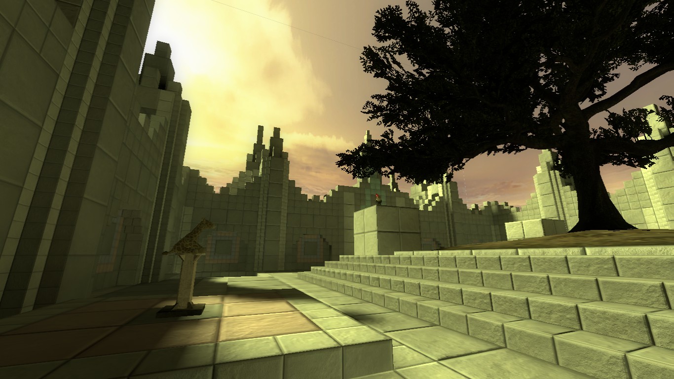
3.jpg 8.jpg 4.jpg# Hex Complex Link is in the download page.
The Office Prank: Part 1 - The Mannequins
http://steamcommunity.com/sharedfiles/f ... =385066916
Fair warning: It is not a puzzle map.
&

Quick reminder: This thread is meant for screenshots and promotion of your map, please refrain from posting links to the maps themselves. They can be added to our download database!
Hi.
Quickie question: Any suggestions on how to make a good skybox that might look similar to this
KyloX wrote:
Hi.Quickie question: Any suggestions on how to make a good skybox that might look similar to this
http://gamesfiends.com/wp-content/uploa ... creen3.jpg
You should post a new thread for "your issue" instead of using the showcasing thread since that kind of question here is offtopic, don't you think?
That skybox in the screenshot lacks a couple of flags in its VTF textures (you can see the sewing lines of the 6 sides of the sky-box). And creating a skybox from scratch is a real pain in the neck, so I'd suggest you to grab any of the multiple skyboxes there are out there. Check out Gamebanana for instance.
d3m0l1sh3r wrote:
Overgrown pics
As someone working on an overgrown map, I can appreciate the toil that went into creating this gorgeous room 
@Radelite In the first picture the ceiling is lacking detail and depth. Darker lighting with a projected texture could be well employed there, along with more props. The blank white ceiling looks bad for such a tiny room, and the dev door texture should, under most circumstances, avoided at all costs. I recommend switching to the greenish underground door texture instead.
In the second picture, the lighting is too dark for plants to grow, and the ceiling is revealing too much low down blank white texture. Consider adding more rubble, foliage, and a projected texture, as well as raising the ceiling
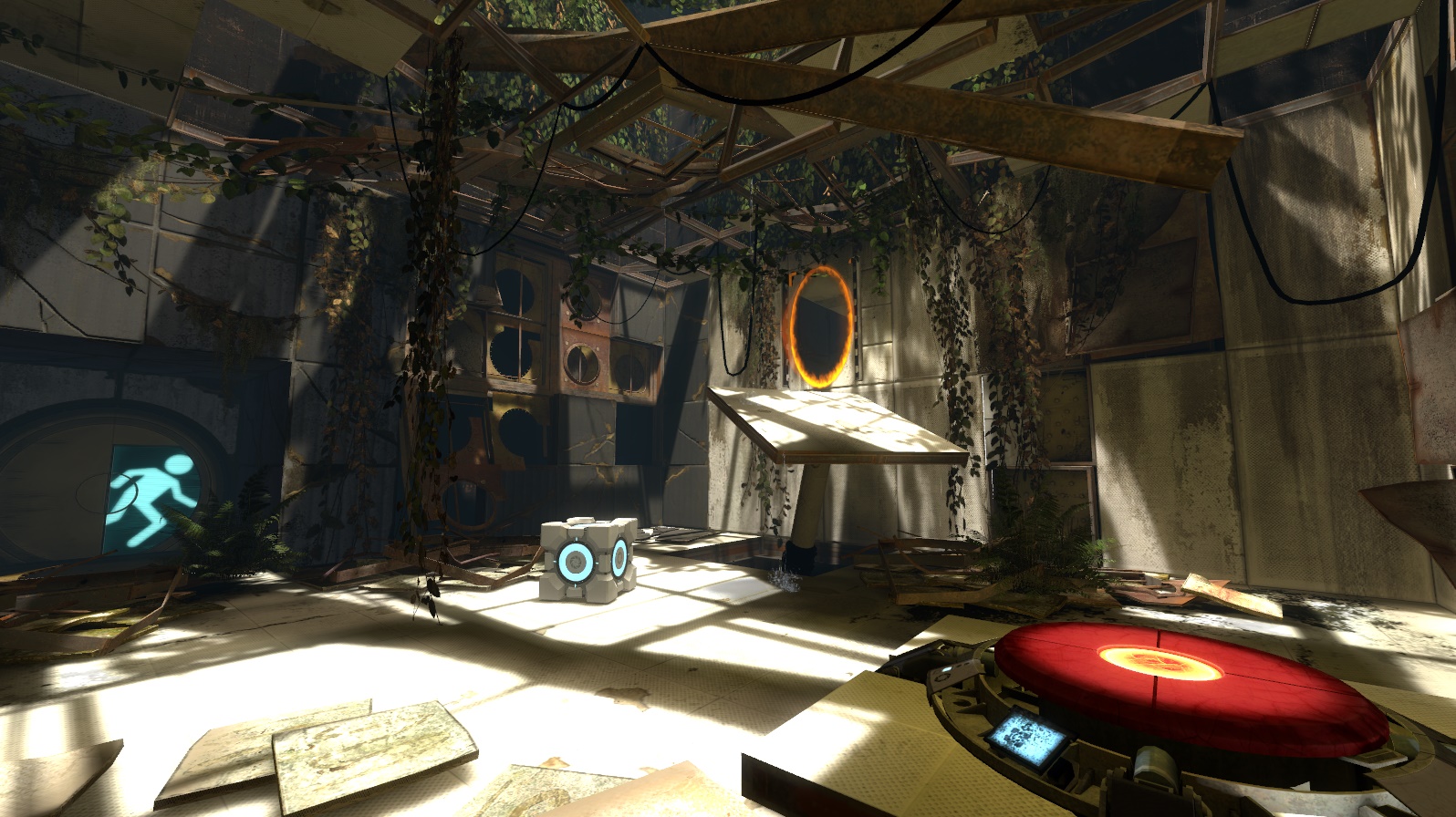
Edit: also here's a pic of P:CT near the end levels since I'm very disfunctional and tend to skip around:
http://steamcommunity.com/sharedfiles/f ... =391059715
(This place won't be explorable it's just for a brief sequence)
Still very much WIP, I plan on adding more small wall pipes and platforms, maybe some windows but it is supposed to resemble a mix of portal 1 and the citadel.
I ask because I want to make my mapping as perfect as possible in both functionality and aesthetics before creating something that I want people to play, and it's hard to do the latter without second opinions.