The ThinkingWithPortals Map Showcasing Thread
radelite wrote:
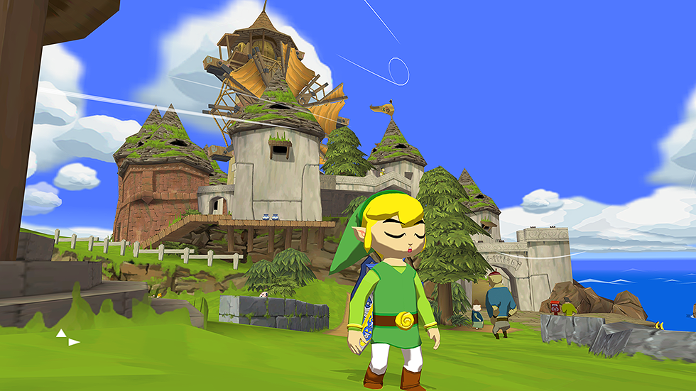
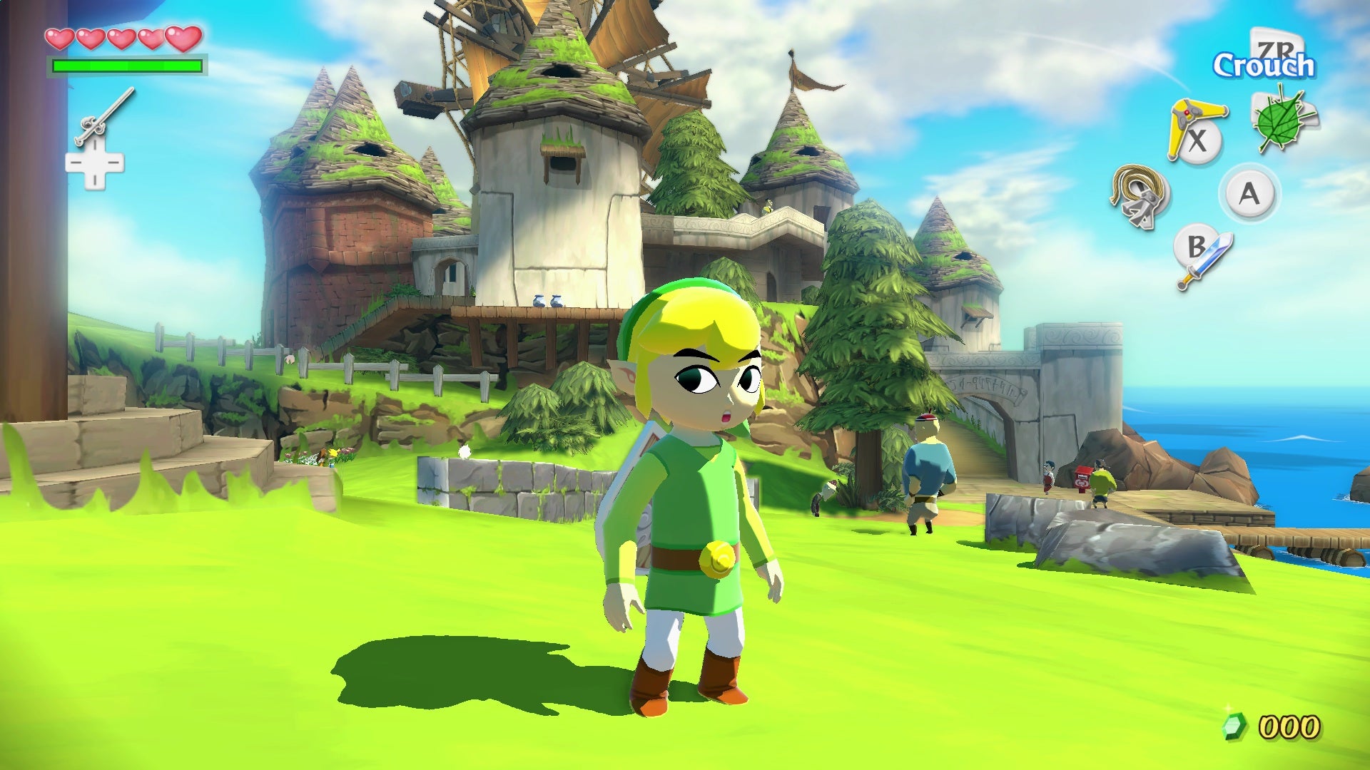
New map I am working on
Honestly, I like this hallway as it is now. It's easy on the eyes and there's nothing blatantly wrong with it at all. I'm actually glad there aren't any projected textures or dark shadows. The only thing I noticed is how the graffiti overlay rests perfectly on top of a wall with support beams. And yeah, it could use some more colors in an easy place, like the door. Projected textures would be distracting, atleast to me, and I bet they would look weird with those wall textures. Walls can always be changed though. Something like the concrete textures in BTS areas might look nice. Unless he's going for a strict P2 theme or something, there's not much I would change.
Maybe there isn't much depth here, but I think the simple design is intended to "support" that nice ceiling.
Is that depth? I'm not sure. It's definitely subtle, but it's enough for me.
That's my preference though! I mostly appreciate just how easy it is to look at.
Like the original Wind Waker!
HD gives me headaches, not kidding
I'm probably biased
(and obviously this hallway is on par with ww's art style)
Crawfish wrote:
Is it allowed to post screenshots of a map that one isn't planning on releasing at all?
I think I've only released 1% of the maps I've shown in this thread. So go ahead! Maybe I'll actually release a finished map here someday. Maybe. 

Another Bad Pun wrote:
Crawfish wrote:Is it allowed to post screenshots of a map that one isn't planning on releasing at all?
I think I've only released 1% of the maps I've shown in this thread. So go ahead! Maybe I'll actually release a finished map here someday. Maybe.
Thank you! Also, that's a mighty pretty screenshot y'got there. I don't think I'd ever be able to dedicate the time to something A4-themed. Way too many massive vistas and props, and I'd probably miss 30 leaks for every 10 minutes of work.
Anyway, as I've said before in pretty much all of my posts, I'm practicing mapping by recreating Portal 1 chambers in a Portal 2 style, just so I can get down all of the things used in them (tracktrains, light textures, etc.]. I seem to be constantly changing how I make them too.
Some are pretty much just texture changes, others add arms and panels and such, and most recently I've started randomizing white tiles and decorating ceilings, in the fashion of some coop maps, and the few clean ones you see in Portal 2 before act 3 starts.
Here are a couple screenshots from my most recent remake, chamber 4. I figured it's small so I'd be able to concentrate more on aesthetics.
Pictures


Any advice?

Crawfish wrote:
I think it's a pretty good start. It's a little bit plain looking though, I would suggest throwing in some global_ents, testchamber and destruction are my personal favorites for a map like this. Some black tiles wouldn't hurt, especially since the concrete in Portal 2 is so much cleaner than the one in Portal.
Lighting is a bit plain too, maybe throw in some light strips or a projected texture? Whatever looks best I guess.
MrBoss wrote:
A map I was working on a while back. Stopped working on it for a bit, but currently trying to finish it off for release
Very very very impressive overgrown detailing there! Keep up the good job, man!!  How much time will it still take you to release?
TeamSpen210 wrote:
This definitely looks quite nice. You should probably remove that orange glow, though. That's unique only to the Portal 1 era levels. You might want to replace it with a bunch of extended panel arms holding the floor up, or the squarebeams models and a BTS scene (use areaportals!). Add a base for the weighted button too (you can't use an instance here, since the window would clip into the normal-sized brush).
To be honest, I'm quite a fan of the orange glow and think it still goes nicely with Portal 2's designs despite not being used in the main game. But I get what you mean.
I'll do some experimenting with arms or a BTS area when I get the chance.
Also, there is actually a button base, it's just sunken into the floor because that's how it was in Portal. Kinda strange, it's the only sunken button base I've seen in either game.
Ciirulean wrote:
Crawfish wrote:
I think it's a pretty good start. It's a little bit plain looking though, I would suggest throwing in some global_ents, testchamber and destruction are my personal favorites for a map like this. Some black tiles wouldn't hurt, especially since the concrete in Portal 2 is so much cleaner than the one in Portal.
Lighting is a bit plain too, maybe throw in some light strips or a projected texture? Whatever looks best I guess.
I get what you mean about the black tiles, I can never decide what looks good where though.
In the next chamber above it (in the same map, just up the elevator), I did more experimenting with tiles and such.
I'm not quite experienced with global_ents yet, so I guess I'll have to look into that soon too.
Thanks for the advice! I'll keep all this in mind in the future.
EDIT: I followed some of Ciirulean's advice, and added some black tiles and global_ents! Opinions?
Images


I think I made decent use of those 64x128 black tiles. I don't think I've ever seen them used though, are they not in the single-player campaign? Or are they just used sparingly?
Also, I might change that ring of black tiles around the cube dropper to be the darker kind like the rest on the ceiling. I thought the contrast looked good at first, but now it's just bugging me.
CamBen wrote:
For the ceiling I recommend making sure the textures are the designated textures labeled ceiling. Also I don't think the black textures are used anywhere in the game except maybe some spots where the devs forgot to change them, but I've seen some people make very efficient use of them as accentuation for the regular gray ones.
I was attempting some form of accenting by using them on the ceiling, and it also gives me some more artistic freedom because I'm not limited to one size of tile, but I guess ceiling tiles are probably there for a reason.
Also, I believe the black tiles are used in the single-player campaign to make things look incredibly "shiny and new" in the reconstructing parts of the game.
Once in a while you'll notice that the tiles that are pulled in by panels when you enter the room are darker than the rest.
Crawfish wrote:
Picture 2
Little detail, try to light the inside of that observation room. It doesn't look like it's lighting the room, if that makes sense? Like the inside of it looks super dim, and I would expect it to be white if there was a light inside of it.
This is looking really good by the way, I don't really like the 2 different colors of black tiles but that comes down to personal preference really hehe
quaternary wrote:
Crawfish wrote:Picture 2
Little detail, try to light the inside of that observation room. It doesn't look like it's lighting the room, if that makes sense? Like the inside of it looks super dim, and I would expect it to be white if there was a light inside of it.
This is looking really good by the way, I don't really like the 2 different colors of black tiles but that comes down to personal preference really hehe
I'm using the stock instances for observation rooms. I think they just look like that because the map is compiled in LDR-only in the pictures.
But I know what you mean about the different tile colors. Like I said, I thought the contrast would look good on the ceilings, but after looking closely I decided I was very wrong.
I still like the idea of the ceiling having dark tiles and the walls having bright tiles though. And thanks!
EDIT: I loaded the map in HDR, and the observation room was still dim, and the larger one in the room turned out to be too bright in HDR, so I used a different 256x observation room, and brightened the internal light in the small one. I also made all the ceiling tiles the brighter black.
Picture

josepezdj wrote:
MrBoss wrote:A map I was working on a while back. Stopped working on it for a bit, but currently trying to finish it off for release
Very very very impressive overgrown detailing there! Keep up the good job, man!!
It's basically done. Just the final touches. I sadly dont have much time atm. hope to have it finished in around 2 weeks


josepezdj wrote:
[pics]
Very impressive detailing, Jose! I would love to give it a try after it comes out, even if I know I have a low chance of completing it.  Any idea when it'll be released?
Anyway, I'm working on a mappack that has a little backstory in it. I'm not completely done with the story part yet but I can show you guys a little of what I've finished, hopefully it can be further improved.
Test Chamber Pics
My first attempt at creating a Wheatley themed map. It's not exactly Wheatley themed, but more of the Co-op Course 4 theme.


"Story" pics


**Feedback would be much appreciated!**
josepezdj wrote:
[IMAGES]
I like the fizzler(?) you're using!


RectorRocks wrote:
Test Chamber Pics
My first attempt at creating a Wheatley themed map. It's not exactly Wheatley themed, but more of the Co-op Course 4 theme.
The custom textures are a little pixelated, can I fix that problem?
I'm having a little trouble with the light glow of the lamp hanging model. I'm not exactly sure which values do I put in in order to make the glow stay as bright whereever the player moves
The light strip placement is random and you have backpanel textures where there should be wall textures. Things like this and this look really out of place and you also shouldn't be using Portal 1 textures.
RectorRocks wrote:
"Story" pics
The textures are flat and not very fun to look at, and the Portal 1 textures aren't helping. You are also using sprites wrong.
But aside from that the test chamber pics are looking pretty good.
Ciirulean wrote:
RectorRocks wrote:Test Chamber Pics
My first attempt at creating a Wheatley themed map. It's not exactly Wheatley themed, but more of the Co-op Course 4 theme.
The custom textures are a little pixelated, can I fix that problem?
I'm having a little trouble with the light glow of the lamp hanging model. I'm not exactly sure which values do I put in in order to make the glow stay as bright whereever the player moves
The light strip placement is random and you have backpanel textures where there should be wall textures. Things like this and this look really out of place and you also shouldn't be using Portal 1 textures.
Imo, those portal 1 orange hazard stripe textures fits ok, because of warm atmosphere of the test chambers.
Also backpanel textures are great if used smartly and in there I'd say theres nothing wrong how they are. Except on this and this where the pits are. You could remove the wall and leave it empty so player could see under floor panels.
Like this floor here, if you get my point.

Also talking about light strip placement. It should be okay for them to be replaced quite randomly if its wheatley themed or in a way that makes no sense.
ebun light strups

Last thing. I don't get it why people are complaining about visual choises if they differ from the original Portal 2 aesthetics. To be honest seeing something new and unique is always a good thing, right?
RectorRocks wrote:
Pics
Looks pretty good! I'd reccomend some more destruction in the Wheatley test. Consider that if a vacuum tube crashed through the wall, there probably would be some debris. Also more dangling wires may be nice. I do like the warm light in the enclosed tests, however I remember the more open tests in the game having a blueish light which looked nice. Maybe you'd want to try that.