Feedback on a mapping style
274 Posts
Posted Jul 10, 2011
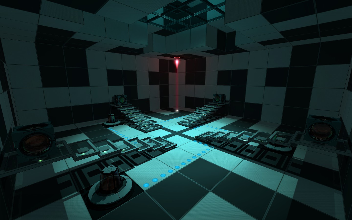
I'm working on a map called "Patterns", and I want to know what people think of the style?
2011-07-10_00002.jpg
I made this in about 2 hours by the way
Images
1

Registered users don’t see ads!
Register now!
142 Posts
Posted Jul 10, 2011
Replied
2 hours
later
I would think that someone would have a hard time solving a puzzle if every room had so much going on with the textures. However, it is a neat vibe you have going there, so popping in a room like that now and then wouldn't hurt.
305 Posts
Posted Jul 10, 2011
Replied
14 minutes
later
I can't say I really like the stair; it's just a tiny little thing that jiggles me, but, well, they're floating. Now we know how test chambers are constructed at aperture, with panels and suchlike, things like that just sort of add a feeling of inconsistency. Also, although I'm sure it was intentional, the light is a little dim and uncomfortable. Aside from that, though, it's good; I, personally, like the wall style, though it's maybe a little bit over the top.
401 Posts
Posted Jul 10, 2011
Replied
1 hour
later
To me it looks very cool. I think it`s a bit too dark til yet. But don't make it too bright. This would destroy the atmosphere
23 Posts
Posted Jul 10, 2011
Replied
26 minutes
later
Stairs, lighting and colorscheme are beautiful. Maybe make the lights a bit brighter, and soften the falloff just a bit. The wall pattern is nice, but I definitely wouldn't overdo that, as Donut said. It would be great for walkways, and areas without a puzzle, or much of a puzzle to them, but the usual style wall texturing in normal chambers.
2,460 Posts
Posted Jul 10, 2011
Replied
2 hours
later
Very interesting! The walls look great but they need to have some kind of consistent-yet different designs. (I know this is just a WIP but cant help suggesting  )
)
Do those stairs move out from the wall cause that would look awesome!
??????
???????
_ to?????_
) Do those stairs move out from the wall cause that would look awesome!
??????
???????
_ to?????_
68 Posts
Posted Jul 10, 2011
Replied
5 hours
later
I love it. As everyone said, a tiny pinch of more light will help out the player. As for the wall designs, I think they are great the way they are. I'm not a big fan of puzzles that make walls extremely obvious so the player knows exactly where to go next. As long as the puzzle is fairly simple, walls like this work out and really force the player to think. If this puzzle is anything above a medium-low difficulty though, it'll get frustrating fast.
219 Posts
Posted Jul 11, 2011
Replied
22 hours
later
That looks really good. I just recommend that you avoid making any white surfaces to small, or people will try to shoot portals at them and get confused when it doesn't work. You need to make a map pack out of that or something.
305 Posts
Posted Jul 11, 2011
Replied
1 hour
later
Also, I just realised that the room is perfectly rotationally symmetrical, to and order of four; you should, I recommend, either make the detailing less prominent or take out the symmetry and make it random, because it looks a little... odd, let's say... to my eye now.
274 Posts
Posted Jul 11, 2011
Replied
13 minutes
later
Rubrica wrote:
Also, I just realised that the room is perfectly rotationally symmetrical, to and order of four; you should, I recommend, either make the detailing less prominent or take out the symmetry and make it random, because it looks a little... odd, let's say... to my eye now.
That's the idea, the map is called "Patterns" for a reason. all of the rooms/chambers are going to have the odd symmetry you see here, it's all part of the theme and atmosphere.
169 Posts
Posted Jul 11, 2011
Replied
49 minutes
later
I like. Very nice atmosphere. Can't wait to see it in action. As said before, improve the lighting a little bit (not enough to alter the effect, just to make it slightly more visible) and it will be perfect.
Quite Impressed,
Sound Logic
Quite Impressed,
Sound Logic
274 Posts
Posted Jul 16, 2011
Replied
4 days
later
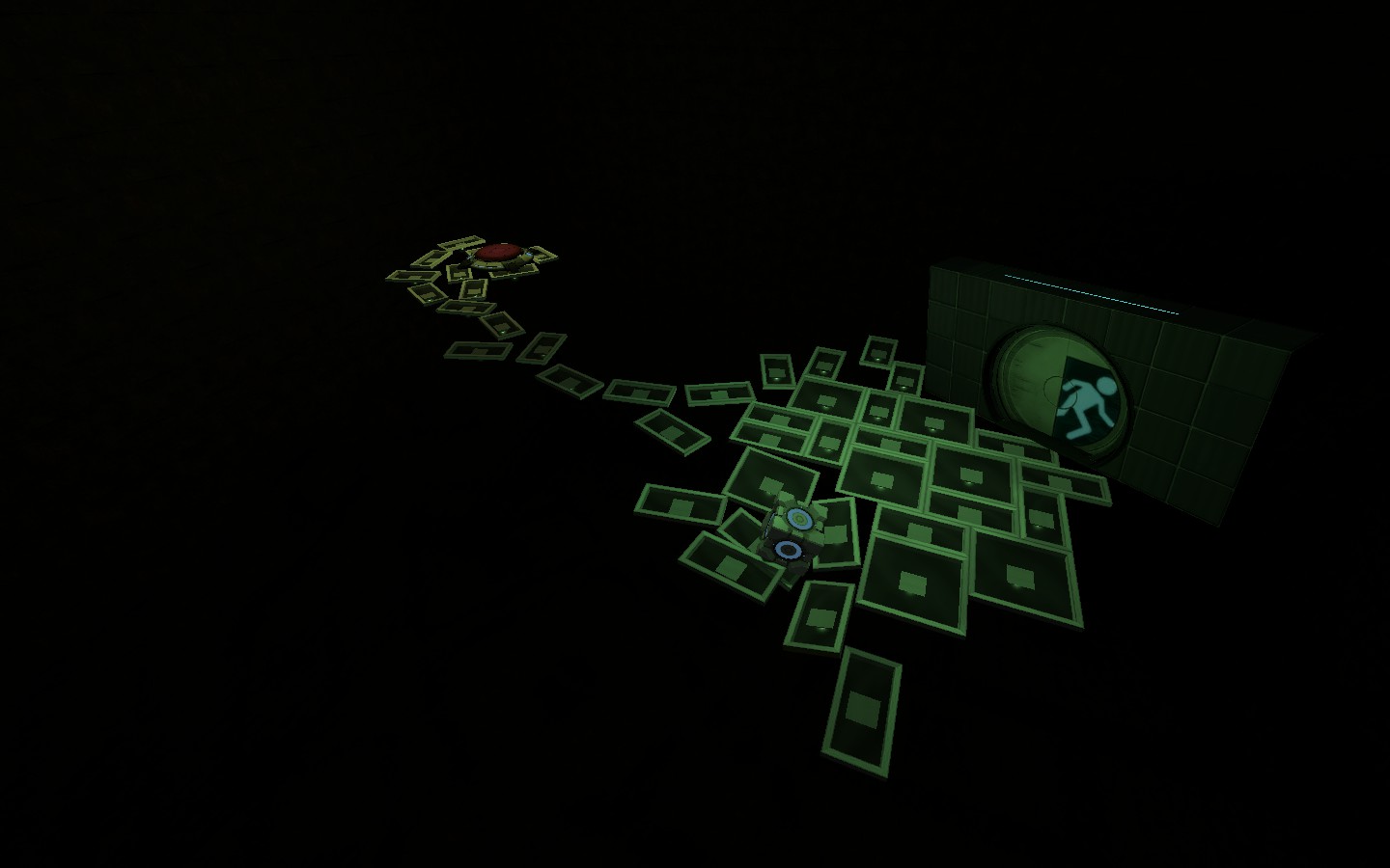
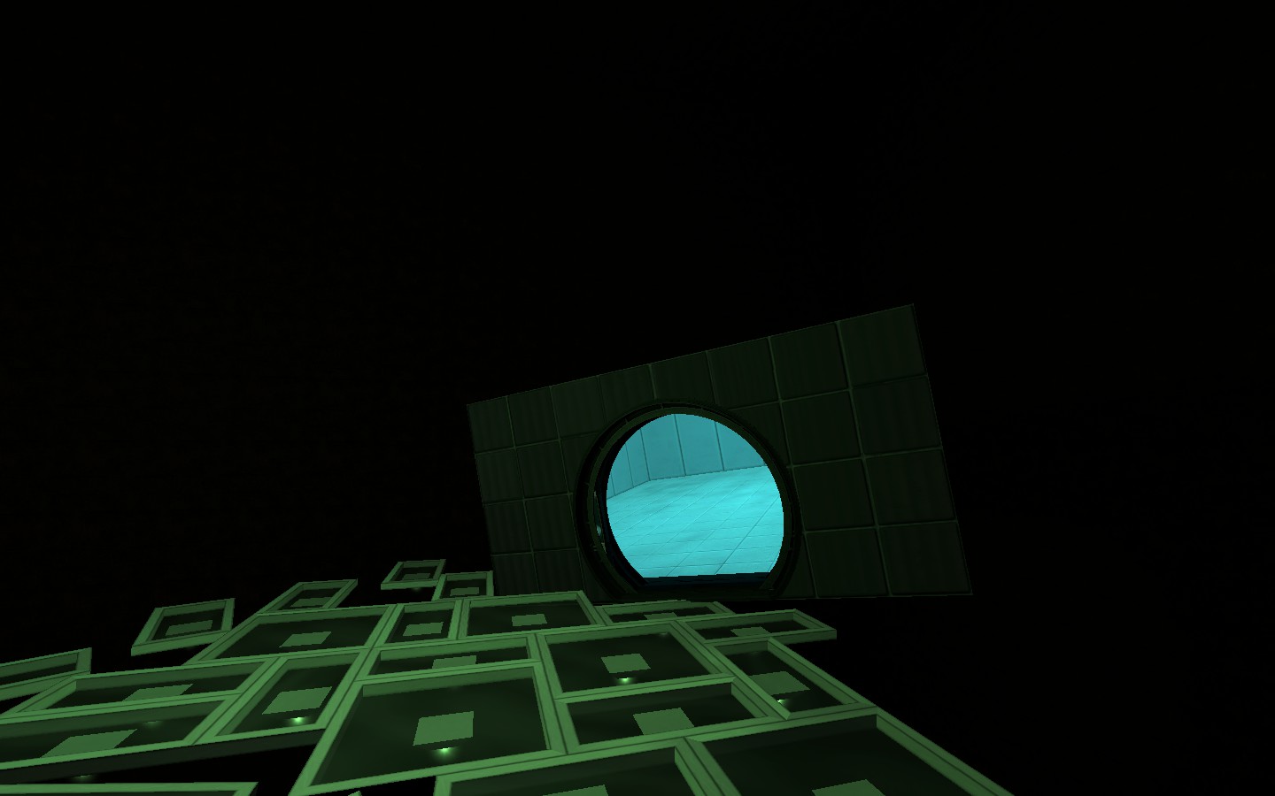
More on patterns. Some new environment styles, more feedback please
Images
2
274 Posts
Posted Jul 16, 2011
Replied
18 hours
later
Bump after a day of no replies, come on people let me know if I should continue this!
940 Posts
Posted Jul 16, 2011
Replied
25 minutes
later
You don't need to bump a thread after a day.
Looks good though, reminds me of a few abstract HL2 maps.
671 Posts
Posted Jul 16, 2011
Replied
2 minutes
later
Could be something like "jump from platform to platform or fall into the void". Reminds me to some great games/mods. I like that style, it's so... strange and mysterious.
The groundpanels are a good idea how to use the panel style with glass.
169 Posts
Posted Jul 17, 2011
Replied
21 hours
later
Still liking the effects. Any estimate on when you are going to release it?
274 Posts
Posted Jul 17, 2011
Replied
17 minutes
later
Not sure, I want it to be longer than my other maps though, every map I've made so far is tiny.
169 Posts
Posted Jul 17, 2011
Replied
3 minutes
later
Well, keep in mind that you can release it before you have added all the test chambers.
68 Posts
Posted Jul 18, 2011
Replied
1 day
later
Looks like a dream world. I'd run with the style and really take advantage of the atmosphere by trying this that are usually not fair game due to being unrealistic. Stuff like floating platforms that people seem to have a huge problem with. It could work in an atmosphere like this since anything goes when you're dreaming!
Registered users don’t see ads!
Register now!
516 Posts
Posted Jul 18, 2011
Replied
1 minutes
later
I hope the map features some low or even zero gravity zones. That would be neat!