The ThinkingWithPortals Map Showcasing Thread
FourthReaper wrote:
Or look up the thread in which it was showcased a while ago IIRC.I think I know exactly what it is.
That thread in which those electrical sparks were showcased, if I'm allowed by chicken to link it, is here.
@chicken: Impressive work shown in those pictures btw!  I like much those displacements everywhere and also the special touch that undergroundish style has... I think it's one of the most creative ones based in the underground theme.

Lamarr wrote:
Here's a dump of the intro map I'm close to finishing for my WIP mod.
http://cubeupload.com/im/B0biAN.jpg
http://cubeupload.com/im/IUjWyh.jpg
http://cubeupload.com/im/zlXhF6.jpg
http://cubeupload.com/im/zTIAzw.jpg
http://cubeupload.com/im/g1xylh.jpg
http://cubeupload.com/im/u6WoAd.jpg
http://cubeupload.com/im/JpxYUK.jpg
http://cubeupload.com/im/o8664n.jpg
http://cubeupload.com/im/dPqmNd.jpg
http://cubeupload.com/im/nsU2ba.jpg
http://cubeupload.com/im/VGSW5i.jpg
I remember that map! I hope to be able to play it myself really soon. That intro was absolutely amazing! 
chickenmobile wrote:
So far: puzzle 1 day, detailing 2 days.http://steamcommunity.com/id/chickenmob ... 9830350069
http://steamcommunity.com/id/chickenmob ... 9830358135
http://steamcommunity.com/id/chickenmob ... 9830353075
http://steamcommunity.com/id/chickenmob ... 9830355568
That's great for only two days of detailing. It's looking really neat, and by the look of it we'll be seeing that epic Gel spinning thing (I forget what it called :/) in this map. Good luck with it, I hope to be able to play it soon.
Another map I'm working on. Still working on it.
BTW: This isn't the only test chamber in the map.

MasterLagger wrote:
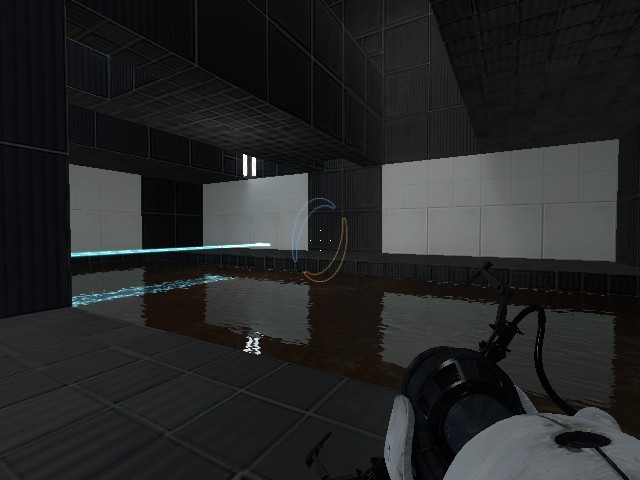
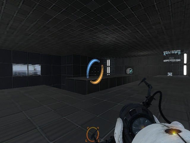
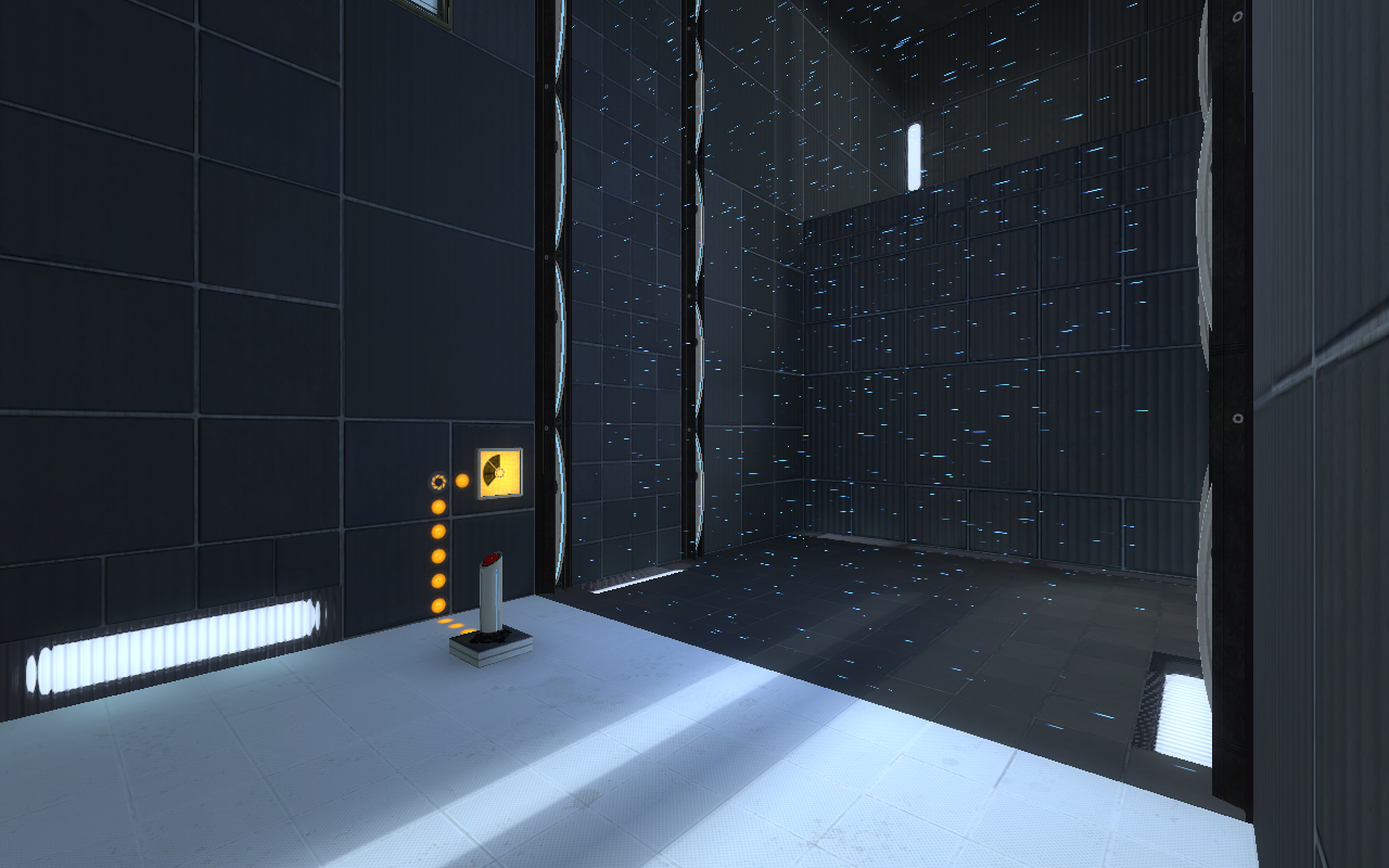
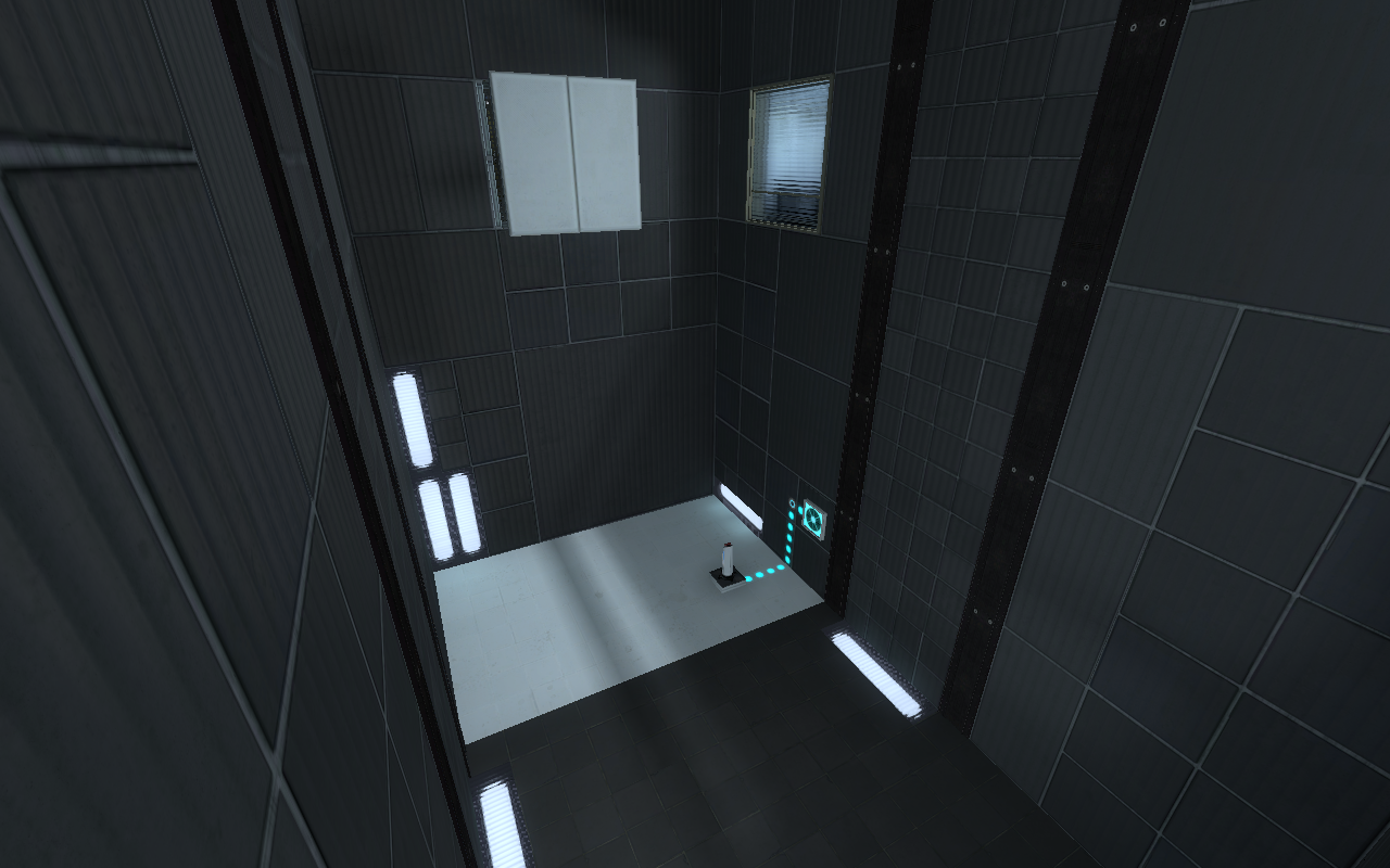
Okay, I added some more lights. How does this look?
I would add more lights if I were you. It still looks dark.
I try not to get annoyed when people suggest things to me, but the fact that someone suggests that the map is too dark (not counting the first WIP pictures of this map I put up, those were pretty dark) when you can clearly see what's in front of the player in the picture tells me someone has a case of scotophobia (fear of darkness), or I don't totally get what the problem is. I'm not trying to be rude, but I don't understand how something can be too dark if you can see what is in front of you. Maybe I can pick up a few tips about lighting in the Mapping Wiki.
MasterLagger wrote:
Gah, I hate gray tiles. Well, I'll give it a try anyway just in case.I try not to get annoyed when people suggest things to me, but the fact that someone suggests that the map is too dark (not counting the first WIP pictures of this map I put up, those were pretty dark) when you can clearly see what's in front of the player in the picture tells me someone has a case of scotophobia (fear of darkness), or I don't totally get what the problem is. I'm not trying to be rude, but I don't understand how something can be too dark if you can see what is in front of you. Maybe I can pick up a few tips about lighting in the Mapping Wiki.
A well lit map makes everything look nicer. It's quite hard to see where things are in a dark map. Especially when there are dark textures everywhere. But hey, whatever floats your boat.
MasterLagger wrote:
Gah, I hate gray tiles. Well, I'll give it a try anyway just in case.I try not to get annoyed when people suggest things to me, but the fact that someone suggests that the map is too dark (not counting the first WIP pictures of this map I put up, those were pretty dark) when you can clearly see what's in front of the player in the picture tells me someone has a case of scotophobia (fear of darkness), or I don't totally get what the problem is. I'm not trying to be rude, but I don't understand how something can be too dark if you can see what is in front of you. Maybe I can pick up a few tips about lighting in the Mapping Wiki.
Something you could do is add more portal surfaces, normally the white textures tend to make the map look brighter. However this might also break the map and since I don't know your map well this might be a generally bad idea in the long run. Just a suggestion of course.
My theory on why your map looks dark is because it's all (for the most part) black wall textures. Even if you have a white light on a black surface it isn't going to show up as well as one may think.
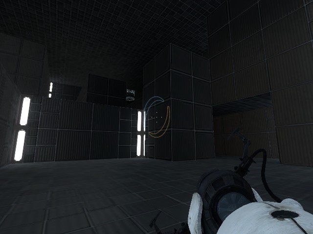
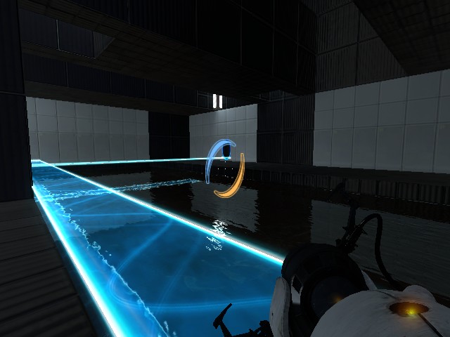
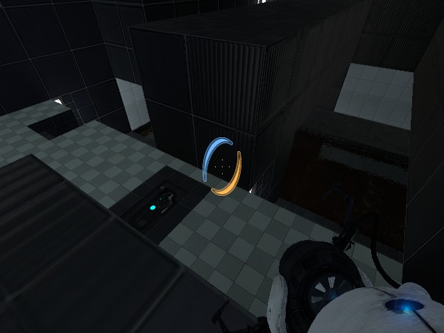
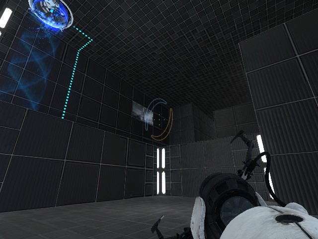
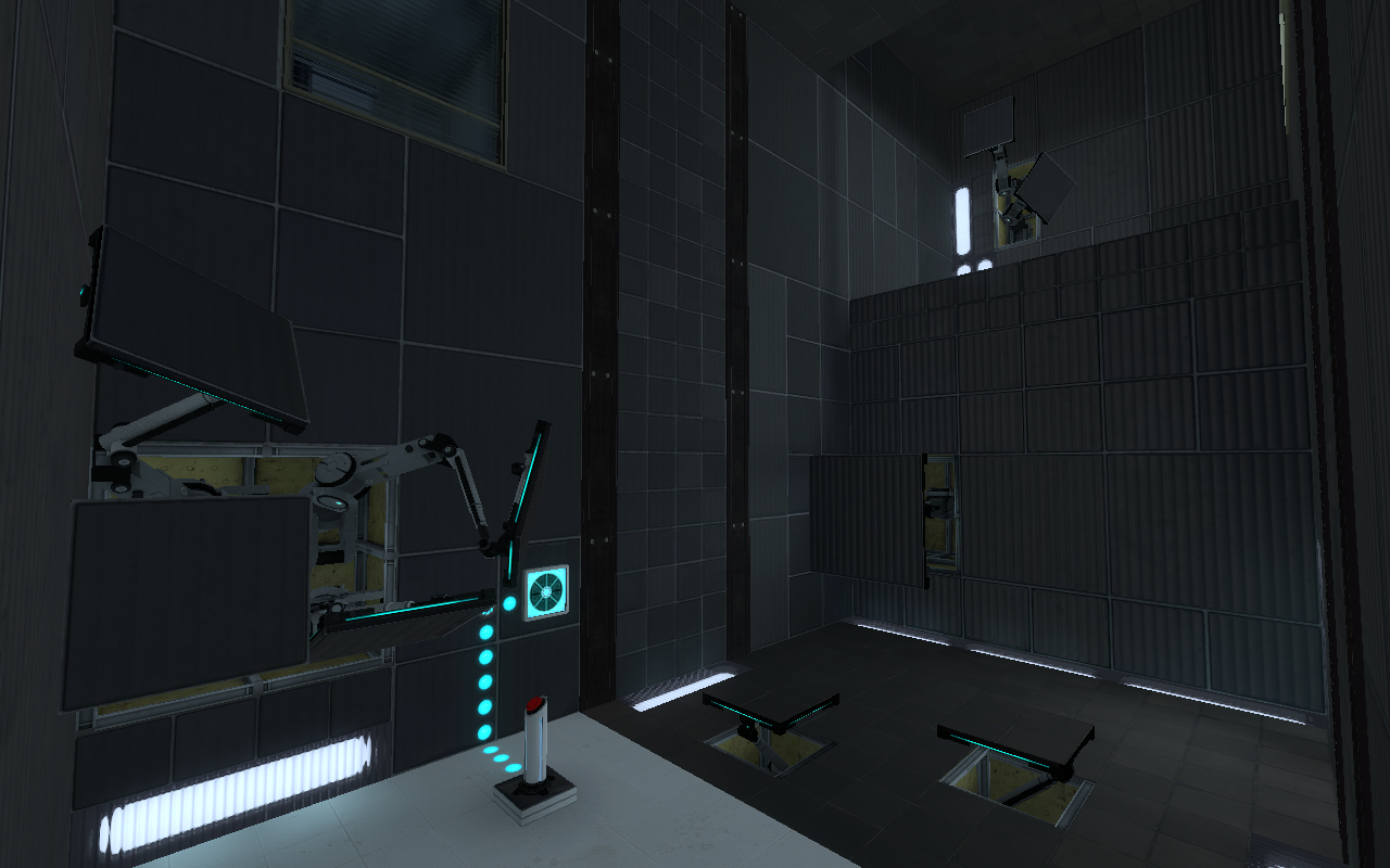
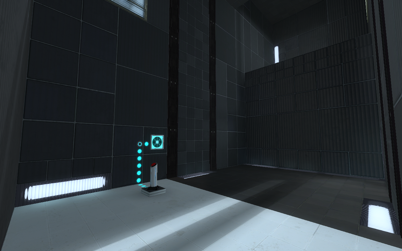
Just showing my progress on a concept, still in WIP:
panelsupangle1.png fizzlerinangle1.png fizzleroutangle1.png panelsinangle2.png
