The ThinkingWithPortals Map Showcasing Thread


FelixGriffin wrote:
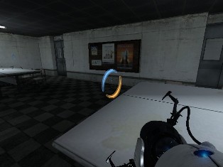
P1-style fizzlers? Do they do something cool?
Yep, it's an alternating gravity field.
CamBen wrote:
the button base actually is 3 units wide, but i'm no complaining, because I accidently made mine 2 units wide. those fizzlers I noticed right away, do they do anything special?
I always thought that the button base it is 1 unit wide. I'll change it.
Habzs wrote:
I always thought that the button base it is 1 unit wide. I'll change it.
It's not really a convention or anything. I usually make mine 2 tiles.
Although a base of 3 tiles provides a nice place to put icons or arrows, if you need those.
Just use whatever works best in any given situation!
Part 1 is a BTS area with Aperture employee entrance into energy ball and gel training

Click any image for a bigger version
Part 1:


Fall into Part 2:


Just out of curiosity: was all that really made in 1 week and a half? because man, that's a huge amunt of detailing!
josepezdj wrote:
was all that really made in 1 week and a half? because man, that's a huge amunt of detailing!
Yep, I've literally done nothing else except sit and use Hammer. The very first day the contest was announced, I made a lot of 'detail instances' that just plug right onto walls and stuff.
You can't really tell, but these are really just two simple boxmaps 
The Irate Pirate wrote:
Is it supposed to be a combination of bts industry and test chamber?
This is two maps with different styles, merged into a single BSP. There are cohesive elements that pull everything together (the portal 1-style brown metal) but I guess you'll have to actually PLAY the thing to better understand what I mean.
Thanks for the kind comments. Let's hope I can get this thing finished in time.
Co-op maps are HARD 
Moth wrote:
Yep, I've literally done nothing else except sit and use Hammer. The very first day the contest was announced, I made a lot of 'detail instances' that just plug right onto walls and stuff.
You can't really tell, but these are really just two simple boxmaps
OK, then I've got my own favourite map for winner already! ... let's wait to play it and check the puzzles though.
Moth wrote:
Thanks for the kind comments. Let's hope I can get this thing finished in time.
Co-op maps are HARD
...and AWESOME!! That map looks super-heavy-duty fantastic! Awesome
That looks awesome, Moth, and I can't wait to play it! I like HEP puzzles, and it should be interesting using two sets of portals.
Moth wrote:
My competition entry: a coop-puzzle consisting of map-within-a-map (mapception?)
Part 1 is a BTS area with Aperture employee entrance into energy ball and gel trainingFall into Part 2:
All the images look great but I really like the look of the tube coming up through the floor!
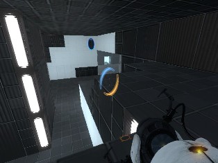
2nd Main Testing Area
sp_ml_watched0003.jpg sp_ml_watched0004.jpg sp_ml_watched0005.jpg
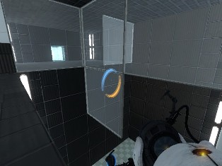
Optional Area
sp_ml_watched0001.jpg sp_ml_watched0000.jpg sp_ml_watched0002.jpg
This is same map I posted pictures here a week and a half earlier, I've just started to expand it more.
MasterLagger wrote:
This is same map I posted pictures here a week and a half earlier, I've just started to expand it more.LpFreaky90 wrote:
You ARE NOT allowed to use a map you were already working on.
ChickenMobile wrote:
Unless you cant count jose, one and a half weeks was the starting date of the competition.
What I understood was that he posted those images 1 and a half week before, therefore he created the map BEFORE that date and then posted the images... am I not right?
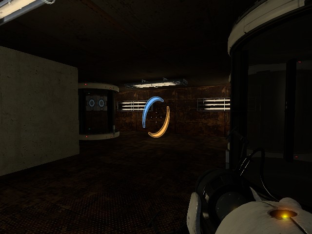
I'm currently experimenting with warm and cold lights to see what shows up better. You can tell in most of the pictures that the lighting is cold. You can also tell I found the old Portal 1 elevator.
MasterLagger wrote:
Right, but I never intended to submit this map into the contest after finding the rules said that the map must be made between the day the contest started, and the the day the contest ends (I still think that rule said the opposite at one point and was edited). I made "Revenge of the Angry Turrets 2" for the contest, but thought it would take to long. So I quit the contest and went back to the other map I was working on and I'm going to normally release both maps.I'm currently experimenting with warm and cold lights to see what shows up better. You can tell in most of the pictures that the lighting is cold. You can also tell I found the old Portal 1 elevator.
A good idea is to have one room with warm orange lighting and then another one with blue, the old blue and orange contrast is one that has worked for a looooong time and obviously fits Portal's theme. Cool lighting generally works in clean theme, and warm in decayed theme.
The Irate Pirate wrote:
A good idea is to have one room with warm orange lighting and then another one with blue, the old blue and orange contrast is one that has worked for a looooong time and obviously fits Portal's theme. Cool lighting generally works in clean theme, and warm in decayed theme.
Well, I took part of your advice. I tried out warm light in an area that's a dirty, metal, maintenance area. And it turned out alright but I have to adjust the brightness to make it a little brighter.
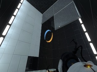
Maintenance WIP
||
sp_ml_watched0003.jpg