The ThinkingWithPortals Map Showcasing Thread
reepblue wrote:
Thanks guys!It is apart of my Beta Pack which I'll hopefully release.
Can't wait to play it  will you release the skins etc. along with it?

I may also release the entire "DLC" folder. I made a few overrides with a vpk, made the gel colors a more generic color, (Still Blue and Orange), Portal 1 viewmodel, added the wirl particles back, and other things.
Here is more


Got cave walls in, it looks a lot better now.

Idolon wrote:
Got cave walls in, it looks a lot better now.
This looks fantastic!Might add some more support though to that concrete above with some truss models around it.
 But the fog color seems a little bright for a cave, no ?
@Reepblue : I love the "E3" portalgun model, I hope you will make a tutorial on how to get it
FireFusorf wrote:
@Reepblue : I love the "E3" portalgun model, I hope you will make a tutorial on how to get it
Well, there are some ways, if you have the model textutes.... Sicklebrick wrote a tutorial here 
Idolon wrote:
Got cave walls in, it looks a lot better now.
Yeah =), can't wait for play it.. 
Improvements? Should I stick with the glass frame I'm using? How can I make the env_projectedtexture look better? Should I add more props in the wake-up chamber? What could I do to just improve it in general?
What about this? Should I ditch the Portal 1 styled entryway? Am I making the pistons right? Does the grating look good there? How about the lighting, should I reposition the env_projectedtexture or adjust the position of a few light strips?
Caden wrote:
Chamber 00Improvements? Should I stick with the glass frame I'm using? How can I make the env_projectedtexture look better? Should I add more props in the wake-up chamber? What could I do to just improve it in general?
Generally, it looks pretty good, although you may want to change the FOV and light colour for the env_projectedtexture. The light colors I usually use for observation rooms, BTS lighting, etc are:
165 196 211 500 (darker colour)
or
198 226 255 200 (lighter colour)
Keep experimenting with the FOV until you get rid of the soft edges. I like to measure it by making sure the light "cone" hits geometry surrounding it. For example, in the observation rooms, I set the FOV so that it's wider than the window opening (that's about 125).
Caden wrote:
Chamber 01What about this? Should I ditch the Portal 1 styled entryway? Am I making the pistons right? Does the grating look good there? How about the lighting, should I reposition the env_projectedtexture or adjust the position of a few light strips?
The P1 entry looks fine, although the top bit looks a bit squished.I don't remember what it was in the original game, though, so I might be wrong.
Lighting is good, though once again, you might like to play around with the FarZ.
Pistons look great there But in regards to the grating, it sorta looks a bit too...solid? Maybe move it back 8 units or so, and put a squarebeam texture underneath it. Though you can't do that on the underside of the platform part, so that may not work.
But overall, looking good
Caden wrote:
Does this look good?What could I do to improve?
Seems too bright
also grates generally go under panels, not to the side of them
BenVlodgi wrote:
Seems too bright
also grates generally go under panels, not to the side of them
So lower the brightness of the projectedtextures and delete the grate in front of the pistons?
Caden wrote:
Does this look good?What could I do to improve?
Nice projtexes! I'd recommend a frame around the grate in front of the pistons or just no grate there, though.
Caden wrote:
Does this look good?What could I do to improve?
Looking good Maybe lower the brightness a little for Chamber 1 (if you used the values I gave you, they're more suited for big(ger) rooms).
In regards to the grating, looking back on it, I think they left the pistons exposed and put grating recessed into the floor, and not parallel to the walls. My mistake.
Caden wrote:
BenVlodgi wrote:Seems too bright
also grates generally go under panels, not to the side of themSo lower the brightness of the projectedtextures and delete the grate in front of the pistons?
I would move the grating about 32 units lower than the floor and make it horizontal.
Personally I'm also still a fan of the orange lighting of the pistons but that's up to you


Coming soon.
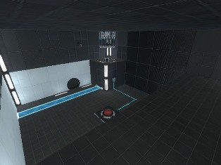
Idolon wrote:
Some pictures
Coming soon.
I smell a new spotlight. The map looks Wicked!
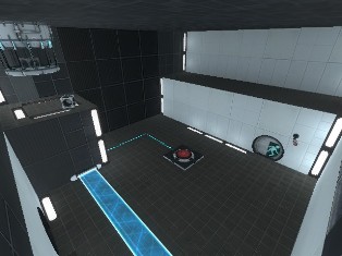
Idolon wrote:
vestibule pics
Coming soon.
Hot-diggity-dog, lookin' very nice! 
Linked Tests
|| 2013-04-16_00002.jpg 2013-04-16_00001.jpg
||
The second part is still taking a while to make, so it'll still be a while until the map's released.