Aesthetic Showcase
Version 2
Caden wrote:
I'm pretty sure everyone here also thinks that I'm less than dirt. That hurts.
People are just inserting their opinions. You've stated that you're somewhat of a beginner, so their trying to give simple, to the point feedback.
Search "Piston" in ttghe models menu. Its the same model used for PeTI lifts.
The shadows are done with an env_projected_texture. It is used in the PeTI default observation window and can be very impressive if used correctly.

At least a little!
Caden wrote:
Just to be clear this is just an initiative for me to get better at using Hammer, it's not like I think I'm some kind of "expert" at this stuff. I don't expect this mod to really be that big of a deal.
well in the OP, you sound like you are recreating the original (made by expert level designers) better than how they did it. While also ramping up the aesthetic quality.... Both are tall orders, and you are no expert in hammer, so you're going to have to do a lot of learning to just get on par with the original.....> Caden wrote:
Recently, as some people remember, I have been working on a mod, or "Map-Pack", that recreates all of the levels from Portal: The Flash Version. This mod is supposed to both fix any problems that the original mod demonstrated, as well as act as a High-Definition remix (similar to rHetorical's Alive & Kicking).
I would love to replay PTFV in Portal 2, so I'll look forward to the final release, which I dont expect to be for a few years, because these things take time 

BenVlodgi wrote:
^^^ Listen to this guy, he makes the prettiest maps ever, look at his signature... check out those maps, learn from the beauty
Wow Ben, thank you so much for such those nice words to me, man  I really appreciate that comment coming from an experienced and awesome mapper like you, dude!
BenVlodgi wrote:
well in the OP, you sound like you are recreating the original (made by expert level designers) better than how they did it. While also ramping up the aesthetic quality.... Both are tall orders, and you are no expert in hammer, so you're going to have to do a lot of learning to just get on par with the original..
This
@Caden: from the orignal post (I mean that other thread, not this one) I was under the impression you were an experienced mapper and I sincerely thought the idea of recreating the PTFM was awesome. But I think you rushed too much with pointing out the failures that mappack had (and I'm guessing you meant the mappack for Portal) and with saying you'll improve it. Don't take me wrong, I still cheer you up to do so, but, with the due respect, the first thing you should improve, and I'm saying this after reading your impressions and opinions about the previous mappack and about your own pictures, is your critical eye and your humility. Meaning that the most important thing is to have the ability to know what could be missing in a scene or what doesn't fit to the environment you're staring at... it takes quite some time to develop a good attention to detail and to polish your tastes.
Even though aesthetics is something highly dependant on personal tastes, there is a certain (implicit) consensus about what looks amazing and what does not, right?
I'm suggesting you to practice this, to check and identify the differences between a well detailed chamber and another one; and try to compare a lot of them... as much as you can... and remember to extract what exactly is what is making you think a scene or environment is awesome. Many meters of white tiles is not attractive at all... you should know that and try to break the monotony by adding some light sources (props), observation rooms, or/and by clipping the brushes and introducing more than just 1 texture along your walls...
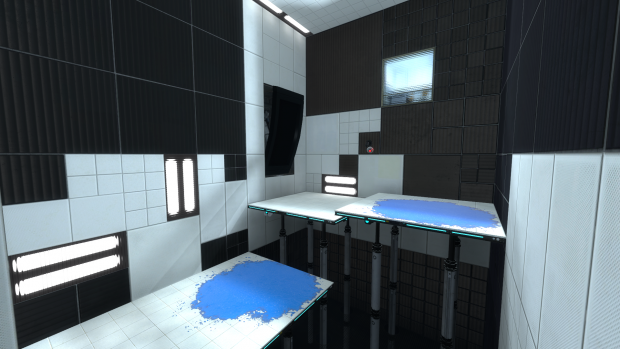
THIS IMAGE is a perfect example! 
Can you see the differences I'm talking about when comparing that with your pictures?
As portal2tenacious mentioned, let's try to actually help out:
-
Those light panels are called light_covers. Introduce them in your level via a prop_static. Find them using the model browser. You have 3 skins for them: cool / warm / neutral. Use whatever of those, and add a light entity for example (this is the easiest/quicker way) in front of them trying to fit the props' mood/skin. Also, you have some instances into your folder sdk_content/instances/light.
-
Use the clipping tool more often and break your walls. try to avoid large rows of the same tile type; I've seen some of your screenshots make use of this... but most of them don't.
-
You can try to avoid simple square shaped chambers or corridors, introduce some corners too, or make some brushes to stand out from the rest to add diversity and cool shadows.
-
Signage is a key element (I personally think). I literally LOVE signage. I use to make a new support for them into each map and to tweak each symbol somehow to make it fit to the rest ot the theme... Also signage is a very distinctive feature in Portal (at least to me
). -
Use more dynamic stuff. Portal2 allows you to use a wide range of moving panels, stairs or lifters. As mentioned above check out for the word 'piston' into the model browser and use them to make elevated floors, instead of making it out of brushes. Add some goo pits too... and if you don't mean to use it as a hazard elemnt, just cover it with a grate, but add some light panels below so the water is noticeable.... and ofc add frames to that grate...
Dunno.... there are many things that could be done... always try to be creative and avoid simple things and laziness 
josepezdj wrote:
BenVlodgi wrote:^^^ Listen to this guy, he makes the prettiest maps ever, look at his signature... check out those maps, learn from the beauty
Wow Ben, thank you so much for such those nice words to me, man :D I really appreciate that comment coming from an experienced and awesome mapper like you, dude!
BenVlodgi wrote:
well in the OP, you sound like you are recreating the original (made by expert level designers) better than how they did it. While also ramping up the aesthetic quality.... Both are tall orders, and you are no expert in hammer, so you're going to have to do a lot of learning to just get on par with the original..
This
@Caden: from the orignal post (I mean that other thread, not this one) I was under the impression you were an experienced mapper and I sincerely thought the idea of recreating the PTFM was awesome. But I think you rushed too much with pointing out the failures that mappack had (and I'm guessing you meant the mappack for Portal) and with saying you'll improve it. Don't take me wrong, I still cheer you up to do so, but, with the due respect, the first thing you should improve, and I'm saying this after reading your impressions and opinions about the previous mappack and about your own pictures, is your critical eye and your humility. Meaning that the most important thing is to have the ability to know what could be missing in a scene or what doesn't fit to the environment you're staring at... it takes quite some time to develop a good attention to detail and to polish your tastes.
Even though aesthetics is something highly dependant on personal tastes, there is a certain (implicit) consensus about what looks amazing and what does not, right?
I'm suggesting you to practice this, to check and identify the differences between a well detailed chamber and another one; and try to compare a lot of them... as much as you can... and remember to extract what exactly is what is making you think a scene or environment is awesome. Many meters of white tiles is not attractive at all... you should know that and try to break the monotony by adding some light sources (props), observation rooms, or/and by clipping the brushes and introducing more than just 1 texture along your walls...
THIS IMAGE is a perfect example!
Can you see the differences I'm talking about when comparing that with your pictures?
As portal2tenacious mentioned, let's try to actually help out:
Those light panels are called light_covers. Introduce them in your level via a prop_static. Find them using the model browser. You have 3 skins for them: cool / warm / neutral. Use whatever of those, and add a light entity for example (this is the easiest/quicker way) in front of them trying to fit the props' mood/skin. Also, you have some instances into your folder sdk_content/instances/light.
Use the clipping tool more often and break your walls. try to avoid large rows of the same tile type; I've seen some of your screenshots make use of this... but most of them don't.
You can try to avoid simple square shaped chambers or corridors, introduce some corners too, or make some brushes to stand out from the rest to add diversity and cool shadows.
Signage is a key element (I personally think). I literally LOVE signage. I use to make a new support for them into each map and to tweak each symbol somehow to make it fit to the rest ot the theme... Also signage is a very distinctive feature in Portal (at least to me :)).
Use more dynamic stuff. Portal2 allows you to use a wide range of moving panels, stairs or lifters. As mentioned above check out for the word 'piston' into the model browser and use them to make elevated floors, instead of making it out of brushes. Add some goo pits too... and if you don't mean to use it as a hazard elemnt, just cover it with a grate, but add some light panels below so the water is noticeable.... and ofc add frames to that grate... :D
Dunno.... there are many things that could be done... always try to be creative and avoid simple things and laziness
I seriously need to find some good way to make a pit. That pit in the picture looks great- but how did he make it? With some sort of Block Light brush and then acid at the bottom? I don't even know a good acid texture...
portal2tenacious wrote:
Caden wrote:I'm pretty sure everyone here also thinks that I'm less than dirt. That hurts.
People are just inserting their opinions. You've stated that you're somewhat of a beginner, so their trying to give simple, to the point feedback.
Search "Piston" in ttghe models menu. Its the same model used for PeTI lifts.
The shadows are done with an env_projected_texture. It is used in the PeTI default observation window and can be very impressive if used correctly.
Argh! I still don't get it! None of them have an animation I can bind them to, which I figured is what the pistons are in the picture. But they won't work! What are some good mechanical dynamic pistons like the one that's in that picture?
Okay, I have experimented with this test for a while now, and I have gone through a few revisions.
I made the platform so it would be supported by platforms, unfortunately I still have no idea how to make a good pit effect, so I didn't really bother with what that; It's just some white tiles.
Then I started applying some H2F textures, to see how that would look
Also, brushes on panels should be 2 units thick, not 8.
Wow, thanks guys . I can't beleive im getting this much attention 
I'm just glad people like my maps. :3
CamBen wrote:
No offense, but that red clashes terribly with the rest of the textures. It also looks very flat in comparison to the other textures.
Really? I like it, and I think it fits with the style he's going for. I do think he should try using some white light panels instead of the cool ones, ( looking in instances it should be called neutral medium light strip or something,) to make the red contrast better. Judging from that picture, you aren't using any global ents. If you look in instances, you'll find an instance named global_ents ( dont use the pti one, and only use the coop one if you're doing coop.)
global ents is basically a giant nodraw treasure chest of fog and color correction that affects your whole map and changes its lighting dramaticly. (remember, fog in source carries light over long distances.) to use it, create a logic_auto and put in the following output: OnMapSpawn, ( your global ents name,) and then the theme you want. it should display a dropdown list you can choose from. I would choose either testchamber, (good for making reds and blues stand out against white,) or bts (which helps when you want your metal tinted ever so slightly blue.) Just mess around with it until you find something you like. you can also change your ents settings with triggers, which means you can give multiple areas in your map different effects. I think I used the testchamber ents in the pic Ben posted, so that the blue paint stood out.
I like where the red is placed; it draws attention to the sides of the test and then up the wall. the piston panels you placed are a little thick though, so watch out for that.
This is how I do mine: I find the piston prop I want. its usually a combination of something like piston_medium and then piston_tip. Then, I create the prop part of the platform by using the static prop piston_lift_top. I put the tip piston into the medium sized piston and fit it into the holder on the bottom side of the lift platform. Then, I create a brush on top of the prop, abouut two units in width. (it has to be more than atlest 2 units wide, otherwise it will glitch when portals are placed on its surface.) I texture the edges with the plastic strip texture and make sure the piston supports has a block of solid nodraw arond it. the pistons are nonsolid normally, so this makes sure you can't shoot portal through it/go through it. ...and done! (remember to texture the bottom with a metal texture or something.) after that you just need to create a pit, which is self explanatory.
as you can see, i do most of my stuff from scratch... unless its light strips. :p It's fine to use stock observation rooms, (but please dont use the pti ones! i hate all of the pti instances, use the hammer ones plz) but i usually end up collapsing it and modifying the light settings.
Wow, I typed alot more than i thought i would. Anyway, I hope this helps!
And thanks for the positive fb everone
+rep benvlodgi for being a cool person
Ninja Edit: just noticed I posted this exactly one month after my last post! Yay!
CamBen wrote:
No offense, but that red clashes terribly with the rest of the textures. It also looks very flat in comparison to the other textures.
It IS kind of texture less, but I didn't make it.
Another Bad Pun wrote:
Wall of post incoming!Wow, thanks guys :D. I can't beleive im getting this much attention :shock:
I'm just glad people like my maps. :3CamBen wrote:
No offense, but that red clashes terribly with the rest of the textures. It also looks very flat in comparison to the other textures.
Really? I like it, and I think it fits with the style he's going for. I do think he should try using some white light panels instead of the cool ones, ( looking in instances it should be called neutral medium light strip or something,) to make the red contrast better. Judging from that picture, you aren't using any global ents. If you look in instances, you'll find an instance named global_ents ( dont use the pti one, and only use the coop one if you're doing coop.)
global ents is basically a giant nodraw treasure chest of fog and color correction that affects your whole map and changes its lighting dramaticly. (remember, fog in source carries light over long distances.) to use it, create a logic_auto and put in the following output: OnMapSpawn, ( your global ents name,) and then the theme you want. it should display a dropdown list you can choose from. I would choose either test chamber, (good for making reds and blues stand out against white,) or bts (which helps when you want your metal tinted ever so slightly blue.) Just mess around with it until you find something you like. you can also change your ents settings with triggers, which means you can give multiple areas in your map different effects. I think I used the testchamber ents in the pic Ben posted, so that the blue paint stood out.I like where the red is placed; it draws attention to the sides of the test and then up the wall. the piston panels you placed are a little thick though, so watch out for that.
This is how I do mine: I find the piston prop I want. its usually a combination of something like piston_medium and then piston_tip. Then, I create the prop part of the platform by using the static prop piston_lift_top. I put the tip piston into the medium sized piston and fit it into the holder on the bottom side of the lift platform. Then, I create a brush on top of the prop, about two units in width. (it has to be more than at least 2 units wide, otherwise it will glitch when portals are placed on its surface.) I texture the edges with the plastic strip texture and make sure the piston supports has a block of solid nodraw around it. the pistons are non-solid normally, so this makes sure you can't shoot portal through it/go through it. ...and done! (remember to texture the bottom with a metal texture or something.) after that you just need to create a pit, which is self explanatory.
As you can see, i do most of my stuff from scratch... unless its light strips. :P It's fine to use stock observation rooms, (but please don't use the PeTI ones! i hate all of the PeTI instances, use the Hammer ones please) but I usually end up collapsing it and modifying the light settings.
Wow, I typed a lot more than i thought i would. Anyway, I hope this helps!
And thanks for the positive FB Everyone :)+rep benvlodgi for being a cool person
Ninja Edit: just noticed I posted this exactly one month after my last post! Yay!
Ah, thank you so much for your feedback on this! I'm glad to see that not everyone thinks the red texture looks out of place, which is good when it's coming from you. I'm actually using that texture for two reasons: I thought it might look cool and, like you said, draw attention to certain areas in the test. The other reason is that I wanted to experiment with Tile's equipment he was using for his mod, H2F, and he let me.
About creating a bottomless pit... yeah, I don't actually know how to do that! There are several things I need to learn how to do, and that is one of them. I could probably just YouTube how to do that though.
But thanks for the lighting and piston support, I'm going to get to work on that whenever I can (for some reason Steam just quit in the middle of typing this message). I don't mind at all how big your message is, as long as it's informative.
By the way... before I read these posts I experimented with the red panels some more, except in the wake-up room for the mod. Am I delivering this right? Or does it look ugly? To me it looks fine, the only problem I see is that the red is not very textured. But maybe that's just because I created it.
http://steamcommunity.com/sharedfiles/f ... =120681406
BTW: I may or may not have fixed some of the grammatical errors in the above quote, it's an impulse. I have to do it!
to find out how valve made things like pits and stuff, just decompile their maps
also .. in this
there isn't a bottomless pit... there is a floor
under the pistons there is the grate, which descends a bit with the backpanel texture, but the grate blocks most light so you cant really tell

Apart from above comment on the picture, do you know that it only takes 1 second to pass that chamber? why don't making that walls non-portalable and force the player to use at least a fling to reach the upper floor? just saying...
Regarding making a pit, is quite simple. You can do 3 different ones: a slime pit, a bottomless pit (Portal2) and a bottomless pit (Portal). For the slime pit, you can follow this tutorial:
euIWMq_JJm0
(I'd suggest you to watch the rest of tutos in SolarChronus youtube channel, they are all really good ones)
The pit used in Portal below the pistons/grates is just a hole you make down on the floor and use special textures with a gradation of color, from orange to black. Browse "gradient" in the texture browser and you'll find a texture called "metal/metalwall048c_gradient"; that one for the walls (use them so the orange part is at the bottom and the balck part at the top of the pit). For the bottom floor, use the texture "lights/light_orange001". Then use grates textures to cover this up; if you use a piston search for the grate texture with a centerhole.
A bottomless pit is explained in the VDC
BenVlodgi wrote:
I'm personally a fan of the lit texture blocks behined the panels, but that may be too advanced for you right now
Yeah that's why I suggested to use a light entity in front of the light panel. Caden, avoid a light entity in the center of each chamber projecting a light coming from nowhere! Try the light comes only from near each light panel and use an extra light entity with a low intensity value (like 20 or so) only if the chamber is too dimmed, or when there are corners too poorly lighten up. But always try to "justify" the light source, ok?
portal2tenacious wrote:
Also, brushes on panels should be 2 units thick, not 8.
Hmmm I think that's incorrect. For the portals to work properly every panel must have at least 4 hammer units
Caden wrote:
[Buttloads of text and quotes]...I don't even know a good acid texture...
:)
josepezdj wrote:
I know what you mean, I just didn't want to make the higher platform a piston, and that floor the bottom arrow is pointing to is where the pit is supposed to be. But I didn't know how to do that at the time.
BenVlodgi wrote:
there isn't a bottomless pit... there is a floor
under the pistons there is the grate, which descends a bit with the backpanel texture, but the grate blocks most light so you cant really tell
For the love of sufficiency, can you just take a picture of the blasted floor those pistons are on?