File Size: 1.16 MB
Downloads: 249
Rating: 1.67 (6 votes)
Description
So as it says in the title, this is my first ever Portal 2 map. I know it's really short and I know most of you will solve it in about 10 seconds. Anyway, all feedback is appreciated. NOTE: I put up the wrong file before and this will hopefully rectify that problem. Don't forget to rate and comment! Enjoy!

Comments
Sign in to comment.
Hey dude,
I love Portal and want to collect some gameplays (first blind run), speedruns and bug reports.
My records should help you to understand how the player thinks.
Well, I hope I can support you with my uploads to fix any bugs and make new awesome maps.
Here are yours!
gameplay
tEzNGKOEEGQ
Needs much work ...level design is your big problem yet.
I think Chamber 3 is the only right and good puzzle. Chamber 2 doesn't make sense! :/
THX for mapping...
Keep it up!
First of all, thanks. This information has been invaluable to me. It's good to get feedback like this.
As for chamber 1 & 2: they were originally a test (chamber 1 being a test on lights and basic button to door activation and chamber 2 being my first test of light bridges and scenery.
I'm sorry a lot of my maps were rather unclear. It's really easy (as I've been playing and re-playing the map all through its development) to forget about how it will look to someone who has never seen it before.
Once again, thanks.
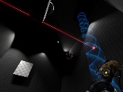
I detest dark maps. Now I know that I detest dark maps with flashing lights even more. To improve this quite ugly map, you need to shrink the rooms, vary your textures, eliminate the pitch black lighting areas, and learn how to recess a funnel into a surface properly. 2/5.
Note to self: top of p. 6.
Too dark.. and simple. The textures aren't beautiful either.
hQU5aBvTvbM
(Link: http://www.youtube.com/watch?v=hQU5aBvTvbM)
So as it says in the title, this is my first ever Portal 2 map. I know it's really short and I know most of you will solve it in about 10 seconds. Anyway, all feedback is appreciated. NOTE: I put up the wrong file before and this will hopefully rectify that problem.
Don't forget to rate and comment!
Enjoy!
File Name: SP_Chamber 1.rar
File Size: 1.16 MiB
Click here to download My First Portal 2 Map [Fixed]