The ThinkingWithPortals Map Showcasing Thread
By the way, The Lost Tests is COMPLETELY separate from the workshop map: Lost Tests of Portal 1

Nice screenshots.
d3m0l1sh3r wrote:
Trying some brushwork
des.jpg
That looks awesome, its all so smooth xD Love the indented parts at the stairs and all the glowsprites at the monitors 
d3m0l1sh3r wrote:
Trying some brushwork
des.jpg
That seriously looks really awesome. I'll have to try some ideas of my own now.
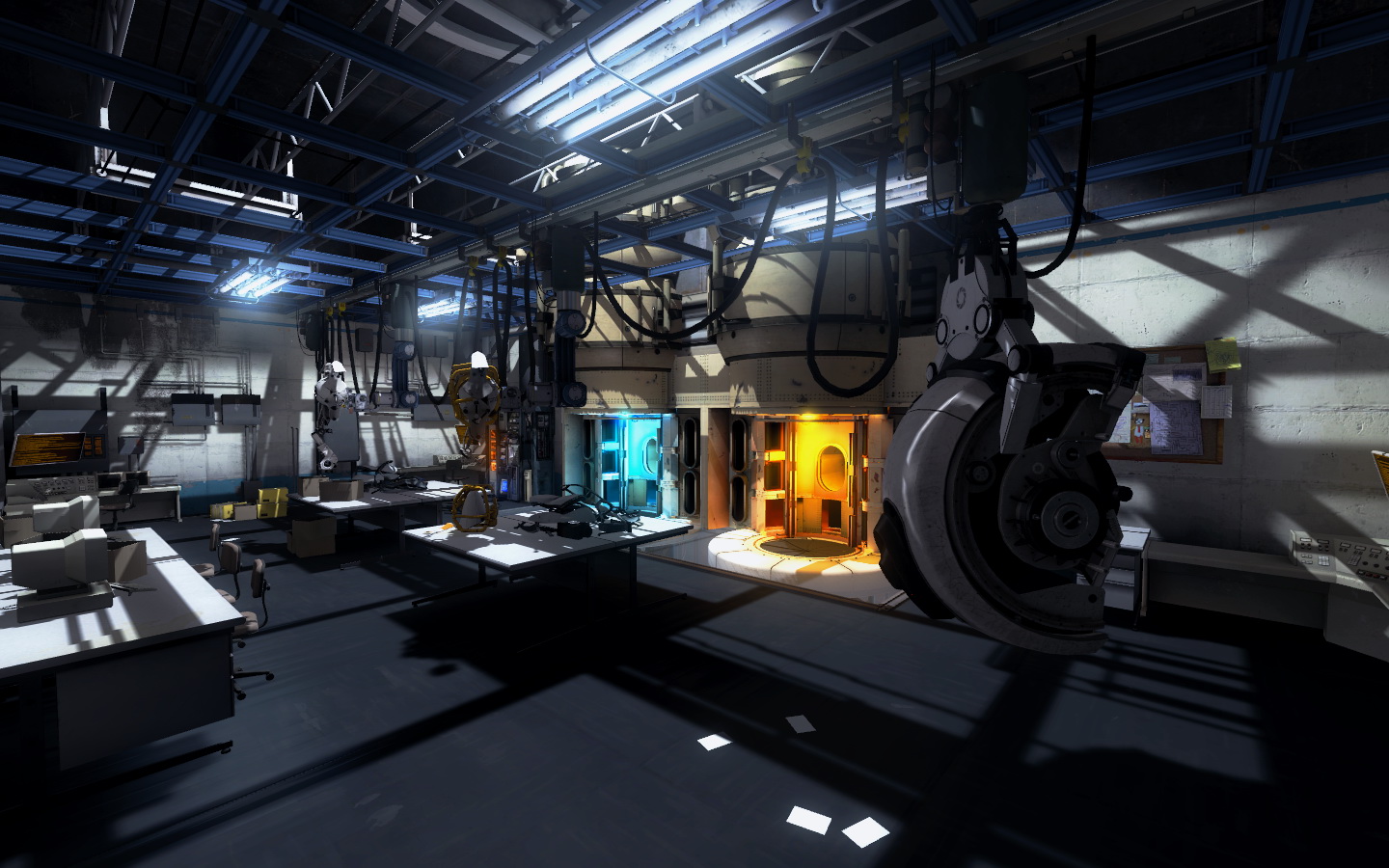
Second map (ony part of it) I've done today. Still need some work.
1.jpg 2.jpg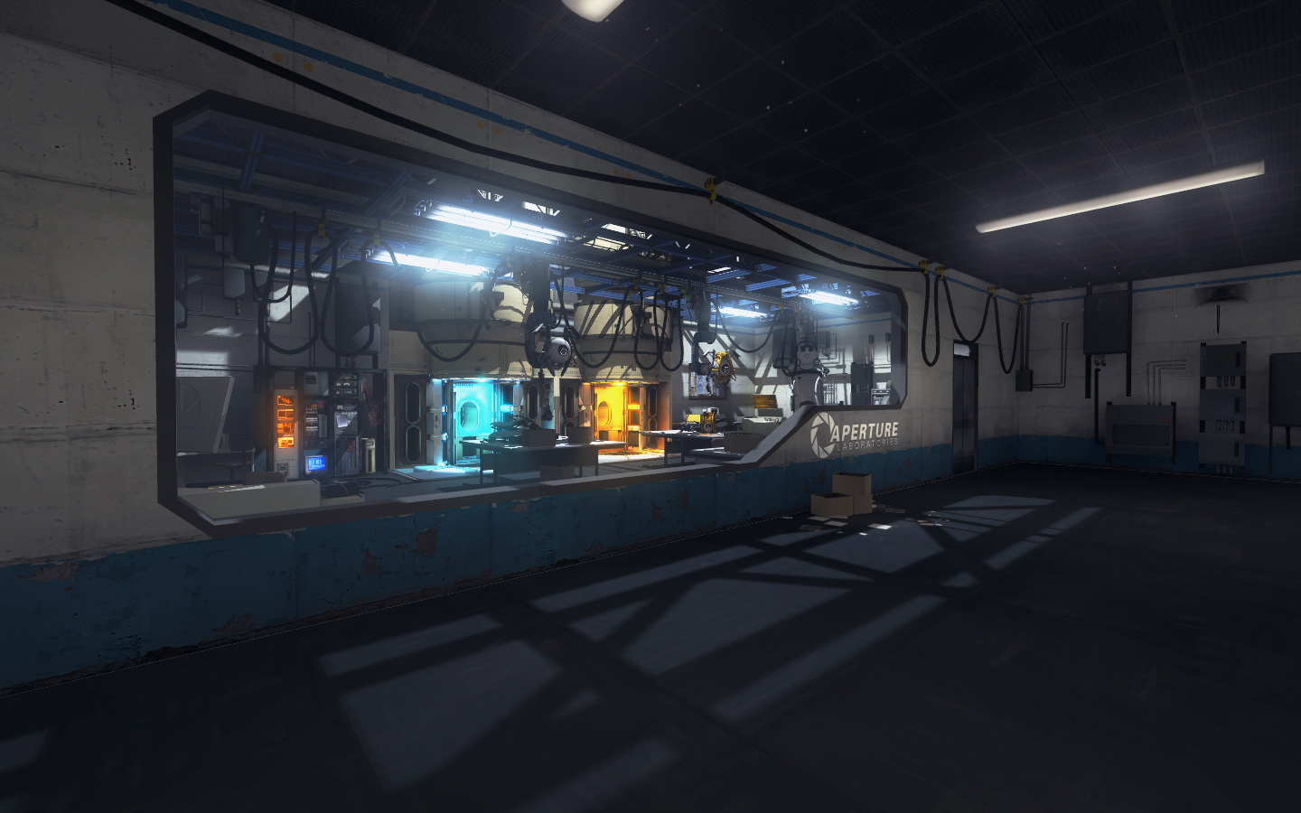
In other news:

The lighting looks okay, but I've never made an overgrown map before, so could anyone who has experience with the overgrown them give me some tips on lighting?
Dr.Toaster Waffles wrote:
That looks very intersting...I hope to play that map soon.In other news:
The lighting looks okay, but I've never made an overgrown map before, so could anyone who has experience with the overgrown them give me some tips on lighting?
I have made a few overgrown maps xD I recommend raising the roof a little higher from the player as the pure white texture is a bit glaring if too close, make sure its not a perfectly square opening either, I see you have used some squarebeams but actually block some areas of the whiteness with brushes of the same size or the silhouette models (which are awesome for roofs), include some cables and bent beam models, think you also need more plants hanging down and dont forget a gentle env_wind to make them blow. Also make liberal use of the moss overlay, there is also a blend texture for white floor tiles with grass.
 Thank you for the advice.
LoneWolf2056 wrote:
I recommend raising the roof a little higher from the player as the pure white texture is a bit glaring if too close
You can actually control brigthness of the /white texture by giving its texture scale higher of lower values.
But raising the ceiling a little is what you should do anyway as Lone mentioned so.


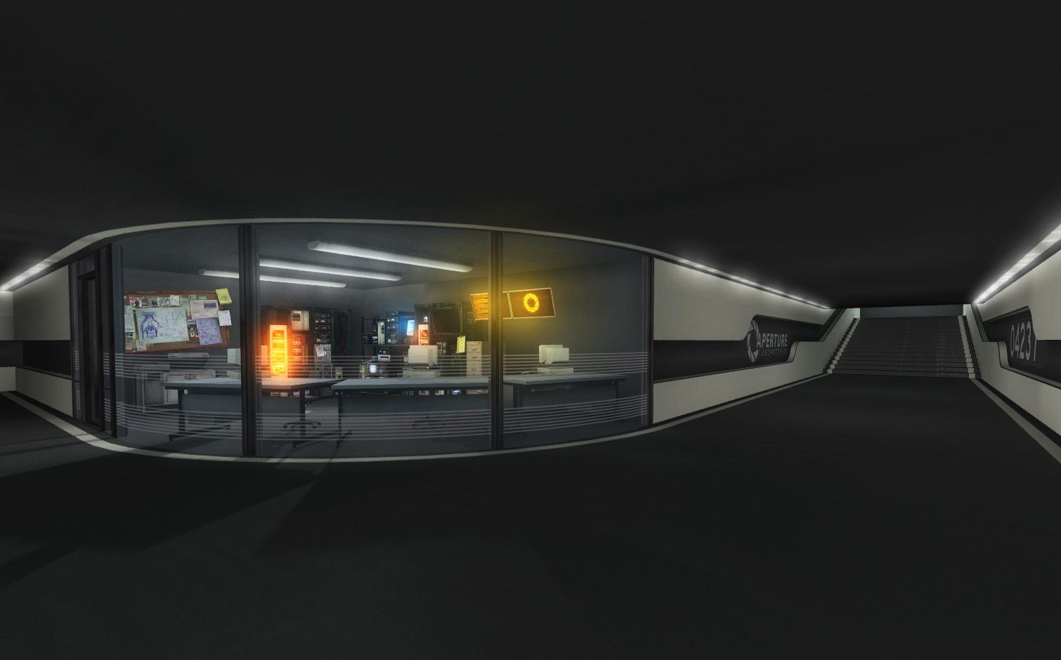
srs bsnss wrote:
-screens-
Well done! I like the bright ambient light by the laser and the ceiling destruction.
2.jpg THIS is what aperture science is SUPPOSED to look like! :biggrin: Great job!d3m0l1sh3r wrote:
Second map (ony part of it) I've done today. Still need some work.
1.jpg


Not enough vines and such, they will be added soon.
Dr.Toaster Waffles wrote:
Not enough vines and such, they will be added soon.
Looks great, love the collapsed floor in the first one , the 2nd pic looks good except it seems a bit dark for plants to grow, especially the large one on the right.
LoneWolf2056 wrote:
Looks great, love the collapsed floor in the first one
I knew something looked off about that plant. I'll make the map a little brighter, it's a bit dark I think.
 [/url]

