The ThinkingWithPortals Map Showcasing Thread
GameBurger wrote:
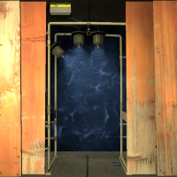
A little something I've been working on lately
("The opening hour", coming this weekend approximately)

That looks pretty nice. I can't see much, but from what I can, I like it.

Arachnaphob wrote:
GameBurger wrote:A little something I've been working on lately
("The opening hour", coming this weekend approximately)
That looks pretty nice. I can't see much, but from what I can, I like it.
Thanks, mate! 
TeamSpen210 wrote:
It's about 0.05 scale...
I'm actually pretty sure that the exact scale is .125, though I could be wrong.
Anyway, the map is looking pretty good. Excited to see how the rest of it will turn out.
Ciirulean wrote:
TeamSpen210 wrote:It's about 0.05 scale...
I'm actually pretty sure that the exact scale is .125, though I could be wrong.
Anyway, the map is looking pretty good. Excited to see how the rest of it will turn out.
Thanks! Im afraid the other rooms might look bad compared to this one D:


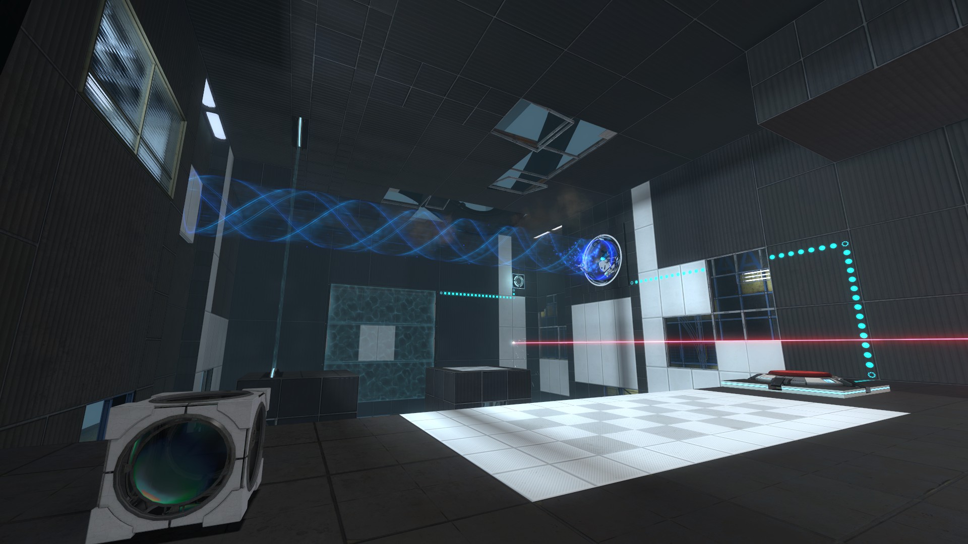
Ciirulean wrote:
Looking pretty good, I especially like the projectedtexture you've got going on, but the lighting in that first room is way too neutral.
Its actually warm if you look closely.
Ciirulean wrote:
Looking pretty good, I especially like the projectedtexture you've got going on, but the lighting in that first room is way too neutral.
The first picture and the first room can be easily confused. But, assuming you meant the actual first room (the second picture), it does look more neutral than cold or warm.
CJLERCH wrote:
Ciirulean wrote:Looking pretty good, I especially like the projectedtexture you've got going on, but the lighting in that first room is way too neutral.
The first picture and the first room can be easily confused. But, assuming you meant the actual first room (the second picture), it does look more neutral than cold or warm.
Oh, yeah. I thought he meant the first pic, which is warm.
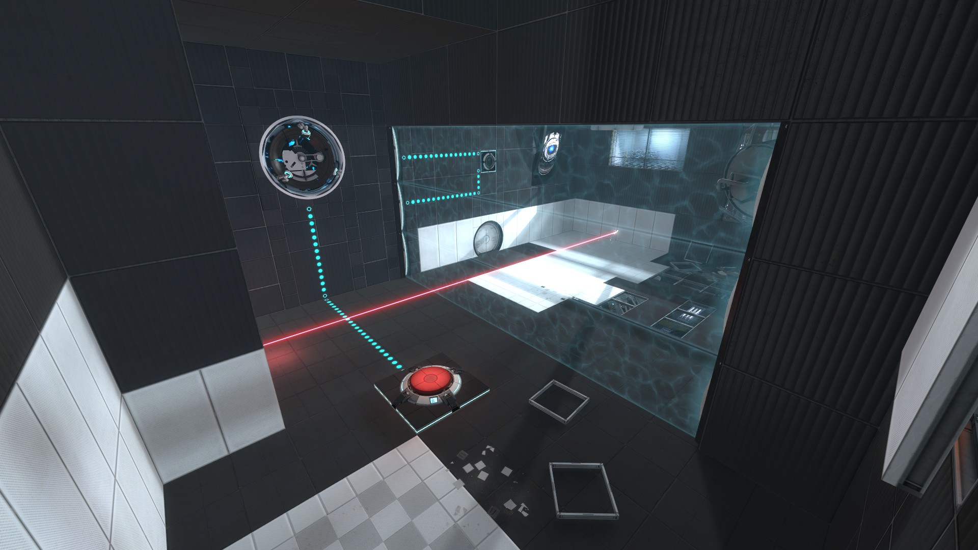
Arachnaphob wrote:
Practicing my clean style:
-snip-
Looks claustrophobic, but not in a bad way. The scaling is just so that it feels both small and spacious at the same time. I hope you can keep that feeling in the rest of the chambers - it's hard to pull off, but it's really great for selling a mood that's hard to put a finger on.


Any suggestions are appreciated

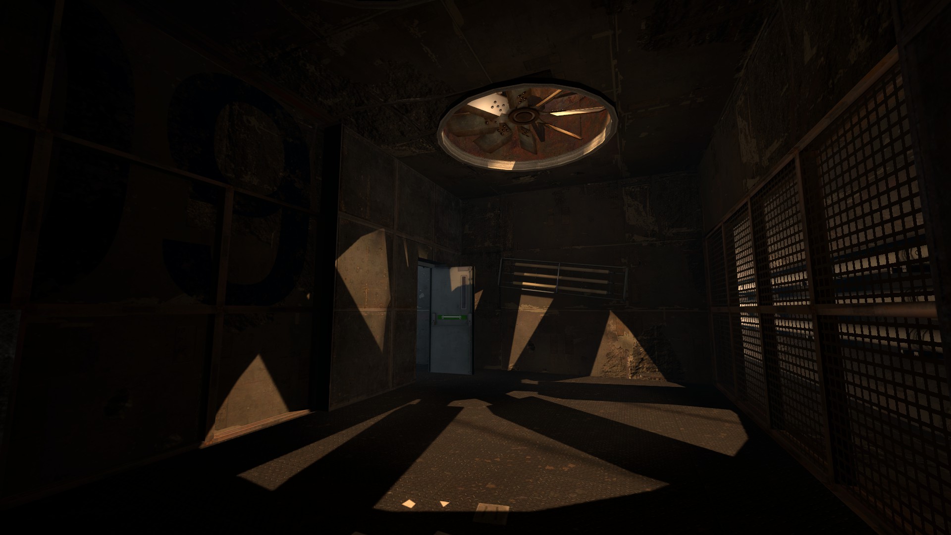
iWork925 wrote:
Exterior arms in last pic are too low poly for how close they are.
yeah they're the cheap qrt_res models the half-res look way better
Other than that the screenshots look really interesting
iWork925 wrote:
Exterior arms in last pic are too low poly for how close they are.Lpfreaky90 wrote:
yeah they're the cheap qrt_res modelsOther than that the screenshots look really interesting
Thanks, i'm going to fix this as soon as possible
[plug]It's actually out now, if you're at all interested in playing.[/plug]
The Lone Future Starter [Map 5] Online, hope that you guys enjoy
&