The ThinkingWithPortals Map Showcasing Thread
I've been toying with some Portal 2 designs. These are some screenshots of one area (BTS); this area is only a small part of what will be something much larger.
http://puu.sh/kohnN/409dcef3b9.jpg
http://puu.sh/kohp9/024d5bb2f5.jpg
http://puu.sh/kohlx/46bc21a62f.jpg
http://puu.sh/koio8/c2419b19cd.jpg
http://puu.sh/koiye/d2a5bbdc6f.jpg
Again, still experimenting with things.
Feedback (including any criticism) is appreciated!

Arachnaphob wrote:
Really really nice! I especially like the detail in the BTS parts. Just one thing: you may want to try lighting things up a bit. It's rather dark all over, especially in the second screenshot.
Thanks!  I watched your video on BTS aesthetics before I started designing, so that helped a lot. The 2nd screenshot is meant to be dark, as it's supposed to be a "the lights died" scene or whatever you'd call it. I do agree that the whole place is a little too dark, though.
So I've decided that I want to recreate the destroyed chambers in the early part of Portal 2, in the clean theme, but with my own additions in some places. I'm currently working on chamber '5' and only have most of the textures in place, but I think it looks good right now.
AuesomeMan3840 wrote:
So I've decided that I want to recreate the destroyed chambers in the early part of Portal 2, in the clean theme, but with my own additions in some places. I'm currently working on chamber '5' and only have most of the textures in place, but I think it looks good right now.
You're using a lot of textures you shouldn't; I'd recommend looking at the textures Valve uses in their own maps for walls/floor/etc. and go off of that. The lighting is pretty weird, looks like you only have one source of light (no light strips or observation rooms or anything) and there really shouldn't be any sunlight seeping in through the ceiling for a map that clean (or any vegetation for that matter). Should be just like pipes and backpanel stuff instead.
Other than that it's looking pretty good. Might want to play around with different fog settings to better suit the clean atmosphere but it's hard to tell without looking at a full compile.
Ciirulean wrote:
You're using a lot of textures you shouldn't; I'd recommend looking at the textures Valve uses in their own maps for walls/floor/etc. and go off of that. The lighting is pretty weird, looks like you only have one source of light (no light strips or observation rooms or anything) and there really shouldn't be any sunlight seeping in through the ceiling for a map that clean (or any vegetation for that matter). Should be just like pipes and backpanel stuff instead.Other than that it's looking pretty good. Might want to play around with different fog settings to better suit the clean atmosphere but it's hard to tell without looking at a full compile.
Thanks for the feedback. I'll go through Valve's maps for the textures, and the reason why I've still got the sunlight from the top coming in, is because I like the shadows that it makes, but I might add some light strips around the droppers and some other areas.
Some full compile screenshots that I did to see what it looked like, and I think it's pretty good so far. http://imgur.com/a/zf06g I added glass in the hole on the roof because I managed to accidentally fling the cube up and get it stuck. Also the fan is pretty random, mainly there to fill up space for now, might remove earlier. The second screenshot is of the roof of the hallway, with just some pipes.
AuesomeMan3840 wrote:
the reason why I've still got the sunlight from the top coming in, is because I like the shadows that it makes
If you use a projected texture you should be able to get just as good (if not much better) results. Act 2's BTS looks really out of place against the sterility of the rest of the map, maybe try taking a look at how it's done in some of the cleaner areas.
AuesomeMan3840 wrote:
I added glass in the hole on the roof because I managed to accidentally fling the cube up and get it stuck.
That doesn't make any sense. Why not just put up an invisible wall over some squarebeams?
http://imgur.com/a/q18ek added in some light strips and also square beams and the like on the roof. Still have a couple things to work on, such as the chamber sign and optimization.
josepezdj wrote:
I'm not trying to be rude, but here's my honest CC: It has a lot of promise but the execution is really bad, especially the textures. There's no consistency. The white walls don't look good against the black ones, the floor doesn't mix well with anything, and the Portal 2 textures/models are jarringly different from everything else in the picture.
Couple this with the boxy design, and IMO it just looks like a Doom level with HD textures.
Ciirulean wrote:
josepezdj wrote:
I'm not trying to be rude, but here's my honest CC: It has a lot of promise but the execution is really bad, especially the textures. There's no consistency. The white walls don't look good against the black ones, the floor doesn't mix well with anything, and the Portal 2 textures/models are jarringly different from everything else in the picture.
Couple this with the boxy design, and IMO it just looks like a Doom level with HD textures.
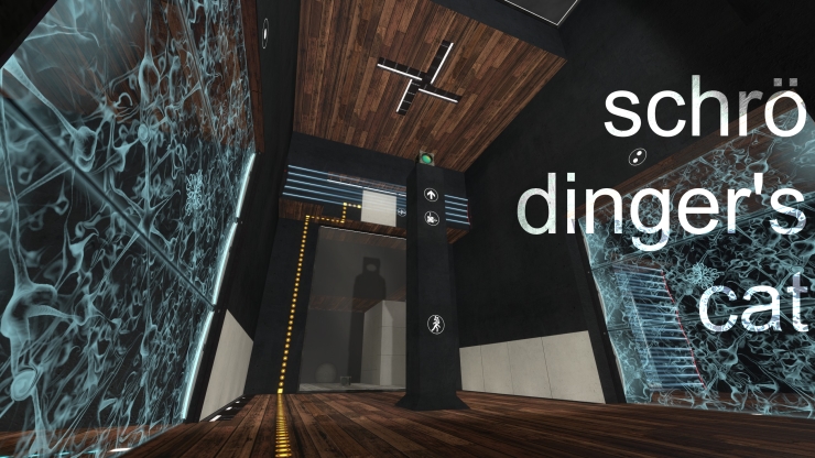
Gonna have to second this. The textures just don't really look nice together; the wood doesn't really go with anything nicely. Sorry.
TreasureGhost wrote:
you should not use Aperture logo antlines, but in this case, big squares.
Hmm... I think I didn't use any Aperture logo antiline, but I'll check for it, thanks.
Cheers!
The wood is definitely a bold design choice but, I think it might work. Adds some color to the room, I suppose? Having just a plain black floor would be super dull so having the wood there shakes it up a bit. I'll have to wait and see how it looks in-game
Working on my first map using the destroyed theme.
http://imgur.com/ZFAQyE1
Got the base shape down, and started detailing it now.

I have a feeling that I will like the design, but not the puzzle