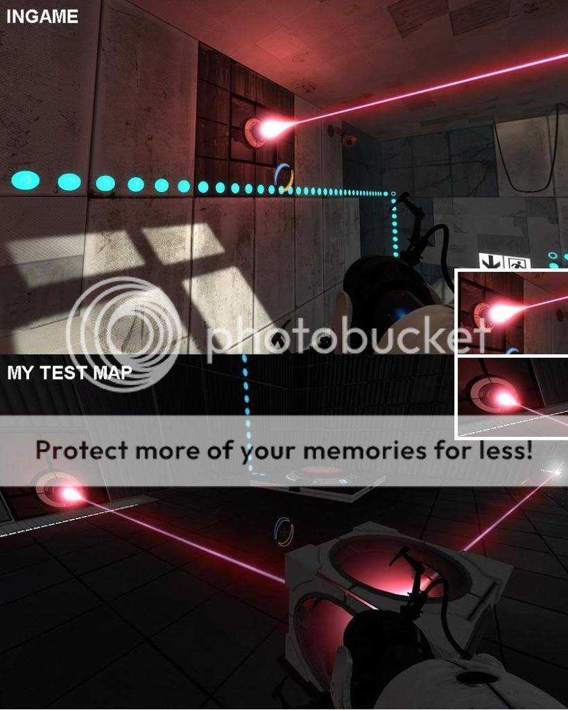
Lasers look different in-game vs custom maps?
Lasers
(keep in mind the bottom picture is close-up)
The lasers on the official maps just seem a lot brighter than they do when I make them. The sprite at the emitter is also larger and the beam is thicker. I've tried with different lighting in my maps but that doesn't help. There really should be some keyvalues to change this. Any ideas on how to make my lasers look more like those in the game?
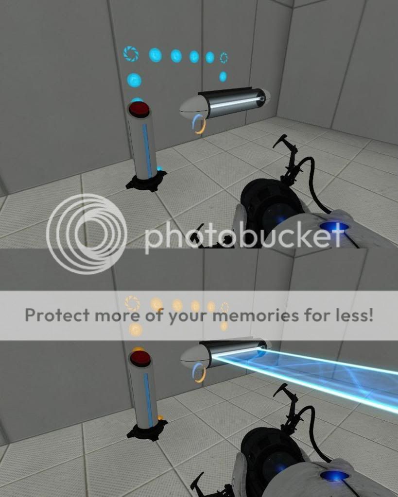
Also a small unrelated thing I need help with; I haven't gone in depth with the logic / math entities in hammer yet so I need some advice on how to make a simple if-check. I just want a button to toggle a light-bridge on and off but I didn't find any "toggle" output for the prop_wall_projector, so I need something like this:
OnButtonPress
if(bridge is on){turn off bridge}
else{turn on bridge}
(screenshot)
If someone could give me a simple example of how to set this up (which entities I need etc) I'd much appreciate it.
EDIT: Both problems solved, thanks for helping me out guys.

I'm guessing there's some trick Valve is using... I bet if I decompiled an official map and compiled it again, it would look just as bad as a custom made map. sigh
Start sp_a4_laser_catapult in Hammer and look how they did the laserwork.
One problem solved =).
EDIT: I'll check that out Ald?z thanks for the reference.
EDIT#2: I got it working with the logic_branch entity, thanks again Ald?z.


The first screenshot is only lit by a blue and a red light with very low brightness plus a lot of func_instance texture lights. For the second screenshot (different room, same map) I just put a few light entities at default brightness 200, so that's why it looks too bright like it has no light at all. I don't think I'll be using the map for anything other than testing so it's fine the way it is.