CubiS
Portal

By: HugoBDesigner
Difficulty: Easy
This map is planned to be part of a DLC of my Portal 1 mod: "Renewable Aperture". This mod will contain 3 DLC to unlock after the main campaign: "CubiS Sector", "Under Construction" and "Normal Test Chambers Track". There's a lot of things to change (for example, the switches textures). So, if you find any bug/error, tell me.
The map uses somethings from Source SDK base 2007. I added them to the file, but they may be bugged. So, tell me anything about.
It uses custom textures by me, edited from SketchUp, and custom models made inside Hammer, all part of this mod. Any questions, ask me at hugobdesigner.com/Renewable-Aperture or comment below.
NOTE: I'm having some issues with my PC, so I'll not be able to update/fix bugs in this map, so if you want to see this map ready, this will only happen in my mod release, at 2013. Visit hugobdesigner.com/Renewable-Aperture for more informations.
||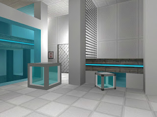
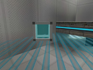
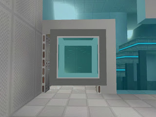
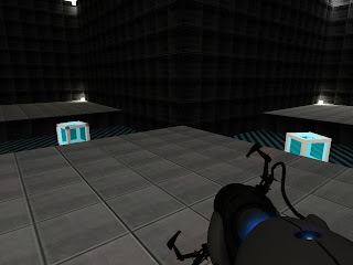
Custom cubes properties (the left cube is "floating", and not a "giant cube")
Non-player collision surfaces (also called "No Touch")
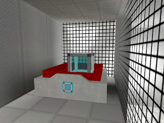
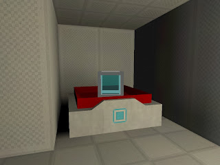
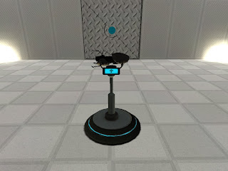
Custom buttons.
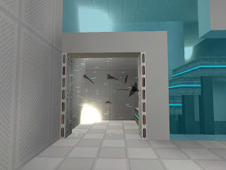
Breaking effect for fizzle.
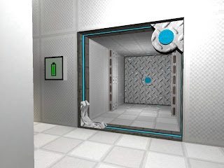
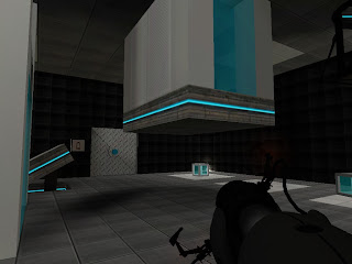
Custom doors and door signage.
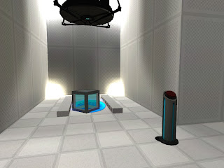
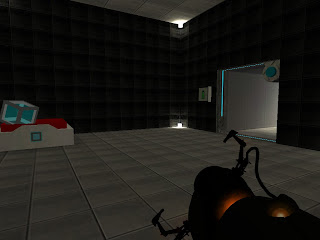
Weight cubes.
The portal gun 
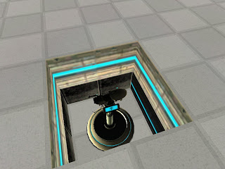
"Out of the wall" surfaces.
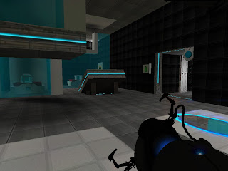
Advanced portals
Poisonous water (and No Touch surfaces)

Custom elevator.||


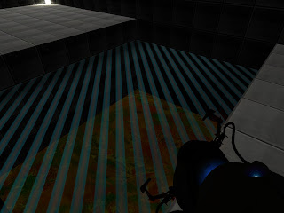
The overall graphical delivery isn't very good, though I can appreciate the work that was put in to it. You've replaced models where there was really no reason to with very blocky, primitive variants. The textures honestly aren't very good (much too repetitive with the gradient effect) and the lighting was...put quite simply, bad. It wasn't clear at all what the different cubes did until I had all three of them in the same place, which was not until the third puzzle or so.
Here's what you can do better:
- Either use the original props with new skins, or make new, better ones (don't use brush models! It's more work but it will vastly improve the way they "feel" ingame)
- Use observation room / recessed wall lighting techniques rather than sticking light brushes in the corner
- Improve your textures, especially the metal ones
- Soundscapes! It was very quiet.
That being said I think you did a nice job introducing all the other test elements besides the cubes and built up the difficulty pretty well. Maybe introduce portals a little earlier on, if they're going to be a central element of the map.
p0rtalplayer wrote:
There's some very nice ideas here, and the puzzles aren't too bad.The overall graphical delivery isn't very good, though I can appreciate the work that was put in to it. You've replaced models where there was really no reason to with very blocky, primitive variants. The textures honestly aren't very good (much too repetitive with the gradient effect) and the lighting was...put quite simply, bad. It wasn't clear at all what the different cubes did until I had all three of them in the same place, which was not until the third puzzle or so.
Here's what you can do better:
- Either use the original props with new skins, or make new, better ones (don't use brush models! It's more work but it will vastly improve the way they "feel" ingame)
- Use observation room / recessed wall lighting techniques rather than sticking light brushes in the corner
- Improve your textures, especially the metal ones
- Soundscapes! It was very quiet.That being said I think you did a nice job introducing all the other test elements besides the cubes and built up the difficulty pretty well. Maybe introduce portals a little earlier on, if they're going to be a central element of the map.
Thanks, man! This map wasn't really made to be "official". Was specially to see what people would think about the style and the "in-game feel". But, obviously, I'll do much more until my mod release. This map was more to introduce the new elements around this "new universe". I'll keep the button and will create better "cubis", turning them into prop_physics and making them easier to understand. These "cubis" will not make part of the mod. As I said, this is gonna be just a DLC, but I'll look to what you suggested. Again, thanks! 
Hope to see more work from you!
Cadeη wrote:
I can say that I enjoyed this map a lot. The textures weren't that great and all, but I actually kind of enjoyed the simplistic feel to it. Unlike p0p, the functions of each cube were pretty clear to me by the time I was done with the first test. The puzzles were pretty clever, although not very thought inducing.
Hope to see more work from you!
Thanks, Caden! I tried to add to this map a Portal 2 looking, but I'm not very good with realistic textures. I made this map to the 1st map contest, but then I've not finished when the contest ended. Then I deleted this map. I thought I would never use it again, but then I decided to remake it. The textures are strange because I just edited some textures from Google (now Trimble) SketchUp, because I could not use other's textures in the contest. But, of course, I'll improve a lot this map in my Renewable Aperture mod, because I'll make it look like the transition from P1 to P2!
(sorry for the bad English  )
)