The ThinkingWithPortals Map Showcasing Thread
spongylover123 wrote:
P.S Blue Portals: Refresh should be for Portal 2 or Blue Portals 2
There is many reasons why we are doing Blue Portals: Refresh as an addon for Blue Portals. One of them is to celebrate the anniversary of the mod. Everything will make sense in due time.

RubyCarbuncIe wrote:
Here is a remake of a map I made a little less than a year ago for Portal 1 that I never got around to releasing, so I figured its about time I got around to doing so. So I am adding it to the release of "Secondary Fire". So enjoy this image:PS. I've always wanted to try changing the font color, and it is AMAZING!

Federal regulations require me to warn you that this next test chamber... is looking pretty good. 


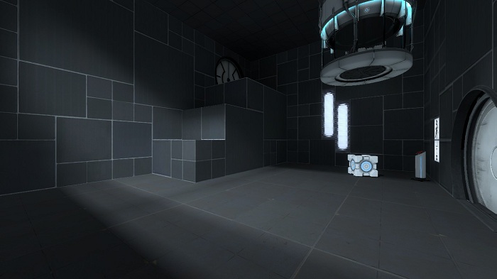
Heavy WIP.
Idolon wrote:
Heavy WIP.
Even if it's WIP , it looks awesome.Keep it up. 


The map lacks polish and is too short so I won't be uploading it but PM me if you want to play it.
gamecreator wrote:
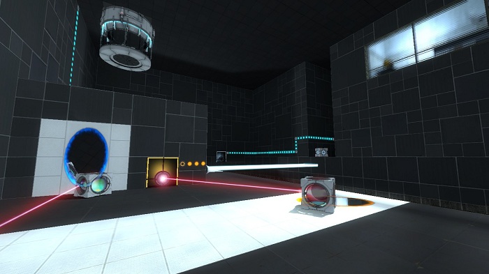
My first map with under 5 minutes of playtime from start to finish. I haven't learned decals and overlays yet but I get the idea from reading the wikis.[img]
[img]The map lacks polish and is too short so I won't be uploading it but PM me if you want to play it.
You should search overlay called 'tideline', place them to just little higher where your toxic goo surface goes(you know how to do it when you see the texture), it makes it look waaay more interesting and better.
SolarChronus has a pretty good youtube channel for beginners. He explains for example aboout those overlays for your toxic slime ledges to make that realistic, and other indicators you may need:
gamecreator wrote:
Thanks! I've actually already downloaded all of his videos to my desktop (as well as SkwittGaming's). I've watched many of them but not that one yet.
Remember to add "Observation Rooms" to make your map feel like it's part of the bigger Aperture Science, also break up the wall textures by diving it into several blocks so it isn't just one sheet of identical tiles.
Thoughts, please!
 I realize that having a variety of different tiles is good, but usually they are more organized. Other than that, this map looks pretty good!
[BETA 7] Aerial Faith Plate Quality Control
It's part of an upcoming MOD
And also a massive bts with literally a hundred doors, almost all of which can be explored in a 1970s-1980s themed Aperture facility wing:
[BETA 4] A very Aperture adventure
Still in active development, needs your comments.
Thank you.
&&