Attn. TWP-ers! TWP in-game Advertising wanted!
Skotty wrote:
In the attachments you can find my part. It's a big model, as you have it for Aperture sometimes hanging around.
Wow, very nice!

zivi7 wrote:
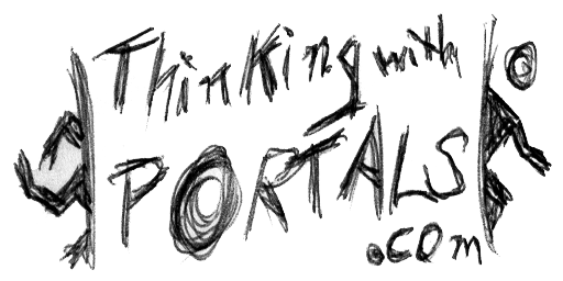
How about a ratman style overlay? This example sucks because I can't reproduce the ratman writing style with my poor picture editing skills, but you get the idea.
Maybe you could try hand-drawing it and then scan it onto your computer. You could use the original ratman overlays as a reference. I think the Ratman idea is pretty good.
Not as good as mine though.
 Thought zivi might appreciate it.
(took 2 minutes) But definitely not better than Master Laggers
chickenmobile wrote:
... definitely not better than Master Laggers

protoborg wrote:
I was just wondering what font was used for the "Thinking with", "P_RTAL", and ""Portal 2 Mapping Community" parts of the site logo. I'm making an elevator video and would like to match the text in the logo as closely as possible. Also, I hope it is OK to use the site logo in my video.
Arial Black for THINKING WITH P_RTALS.COM
and Arial for Portal 2 Mapping Community

(I hope it's alright that I posted a YouTube link here. I didn't know how else to send it.  )
)
This is the wide version (600x400) but i also made a high (480x640) one as requested. =D
Please let me know what you think. =D
PixeledFace wrote:
Here's what I came up with.
You're doing it right.
If the bendy in the centre waved that would be absolutely epic. I just cant get out of my head that he doesn't.
If we believe you win (which I am damn impressed with atm) we will tell you how to give it to us.
Oh and 
chickenmobile wrote:
Two minutes? You're better at this that Doug.
PixeledFace wrote:
Here's what I came up with.
Wow, that looks really authentic. Not something I mind putting in some of my elevators, good job. 
Skotty wrote:
In the attachments you can find my part. It's a big model, as you have it for Aperture sometimes hanging around.
Aww, I'd love to take a look at that because I'm curious about the looks, but alas, that would require too much effort for my indolent self...
chickenmobile wrote:
(took 2 minutes) But definitely not better than Master Laggers
That would be great to put in a bts or hidden area. And your right, it's definitely not better than my pixel poster.
Here's the new version:
http://www.youtube.com/watch?v=eL25zFIG ... e=youtu.be
My Changes:
+Added shadows
+Made "Spotlight"-Bendy wave (as suggested  )
)
+Added transition at the end so it loops 
&
chickenmobile wrote:
zivi put this in-game. Looking at that screenshot, the overlay looks pretty good, but the writing seems a bit small compared to the other ratmann scribbles. (In particular, the other Ratmann stuff seems to have a thicker, bolder stroke.)
To me, the 'P' in 'Portals' should maybe be a bit higher up - it looks almost lowercase in that position, as least to my eyes.
PixeledFace wrote:
IF-I2zjLxZo
Love it. I can see it fitting to the Aperture PSA music! It'd be nice if 'thinkingwithportals.com' was styled similarly to the site logo. Maybe flash up images/video clips of TWP maps on the video?
PixeledFace wrote:
Here's the new version:
http://www.youtube.com/watch?v=eL25zFIG ... e=youtu.beMy Changes:
+Added shadows
+Made "Spotlight"-Bendy wave (as suggested
+Added transition at the end so it loops
Very very good, but I think the last scene with the URL is too short. You really need to be a fast reader for this last text.
BEARD! wrote:
Love it. I can see it fitting to the Aperture PSA music! It'd be nice if 'thinkingwithportals.com' was styled similarly to the site logo. Maybe flash up images/video clips of TWP maps on the video?
Do you mean something like this?
http://www.youtube.com/watch?v=aqFd9AVL ... e=youtu.be
Or without the Aperture Logo (Ring)?
Skotty wrote:
Very very good, but I think the last scene with the URL is too short. You really need to be a fast reader for this last text.
Yeah, the scene really was a bit too short. I made it longer now.