Attn. TWP-ers! TWP in-game Advertising wanted!
Chickenmobile wrote:
- The site name: thinkingwithportals.com should be absolutely noticeable when looking at your object
That's why I thought of the button frames with a small logo at a corner, because it is noticeable but not as much as that exagerated example by Nacimota. Amongst all submitted ideas I would choose the elevator video by Pixeledface too, because I also think that it has the perfect balance of advertising/subtlety.
msleeper wrote:
I will agree with what has been said about the buttons and fizzlers being too obtuse.
Hmmm.. no one said anything similar related with the buttons frames before YOU, but thanks for stating that your opinion is that they're too obtuse, it's nice to hear 
[sarcasm self test completed]

chickenmobile wrote:
@msleeper, Would like to see a monitor with a TWP advertisement. But would people even notice? O.o
Well, I suppose if the observation room is accessible via portals then the player would examine what's inside.

El Farmerino wrote:
2) Convince msleeper to buy http://www.thinkingwithportholes.com
Paypal $9 to [email protected]
chickenmobile wrote:
@msleeper, Would like to see a monitor with a TWP advertisement. But would people even notice? O.o
I have no idea. That's why I want someone to try. I'd do it myself if I had access to my gaming PC.
If it looks good enough, I'll upload the instance so people can use it. Oh, and if you have any suggestions, let me know.
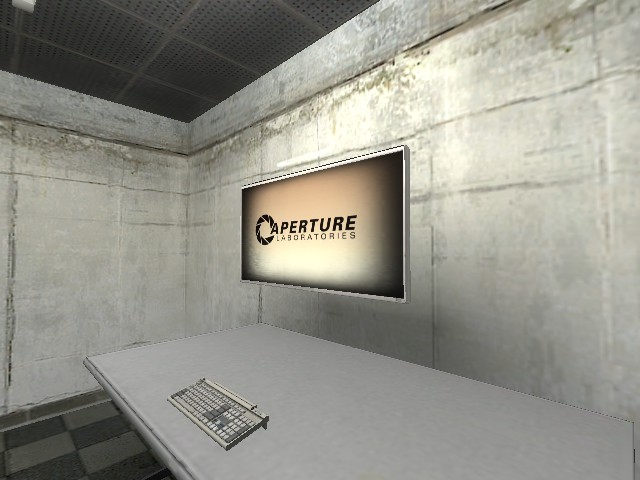
I figure the VGUI movie should be just a big marquee of "THINKINGWITHPORTALS.COM" that scrolls semi slowly in a loop. That, or the site logo, depending on visibility.
Yes, I realize most players won't see it.
Yes, I realize it probably isn't going to be crystal clear.
Trust me, if I had access to my gaming PC then I'd stop posting and just do it myself.
npc_msleeper_boss wrote:
Paypal $9 to [email protected]
I knew that was coming.
If I had the time, skills and paypal account necessary to dedicate an entire website to a single joke I totally would. Unfortunately I have none of those, so I think I'll just make the appropriate changes to the poster when I get a chance to actually make it...
0jhlSWCLRio

npc_msleeper_boss wrote:
You misspelled "attention".
Oh, sorry. ...it happens. 
(Sorry, I just had to say that.)
Destroyed theme:
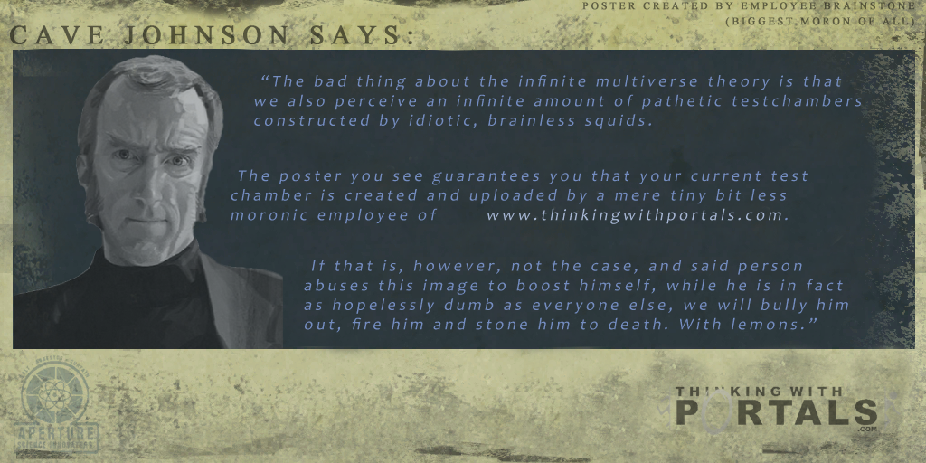
Announcer: "Hello, and again, welcome to the Aperture Science enrichment center. We are currently experiencing technical difficulties due to the over-whelming amount of tests you're about to participate in found in the thinkingwithportals.com branch of Aperture Laboratories. Begin infinite testing in three, two [tape fades out].
Super-clean theme:
Cave Johnson: "[off mic] the thinkingwithportals.com universe, you sure? They design their own tests?[on mic]You're not gonna believe it down there! Greg just told me the universe you're testing in has some of the best tests you'll ever participate in. Lots of science getting done by solving these. In fact we already sent you into one of these tests right now. So get to it.
Old-Aperture theme:
Cave Johnson: "We transferred you to a sealed off enrichment shaft we just uncovered. No one's quite sure how it got here, but it was labeled 'thinkingwithportals.com', whatever that means. Now we want you to solve the tests in the shaft to see if that chicken we sent earlier hasn't died of asbestos poisoning yet."
I don't have ideas for GLaDOS lines, though...