The ThinkingWithPortals Map Showcasing Thread
![[Image 1]](http://i.imgur.com/D4Q6I.jpg)
![[Image 2]](http://i.imgur.com/ytFLn.jpg)

Bayleaf wrote:
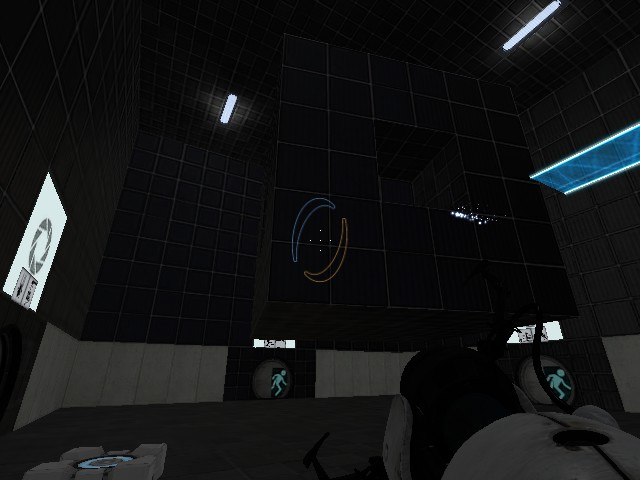
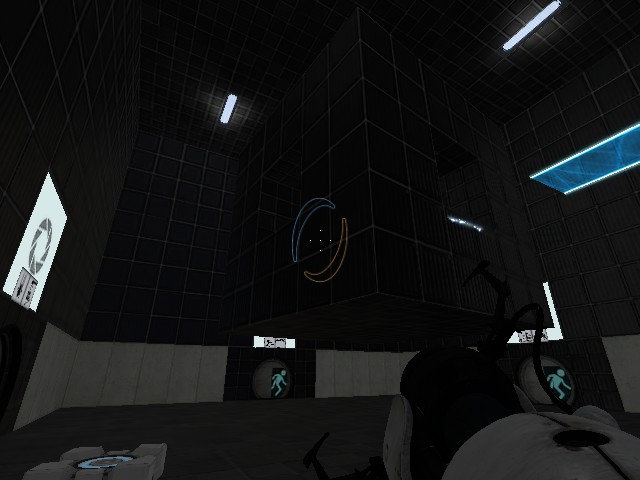
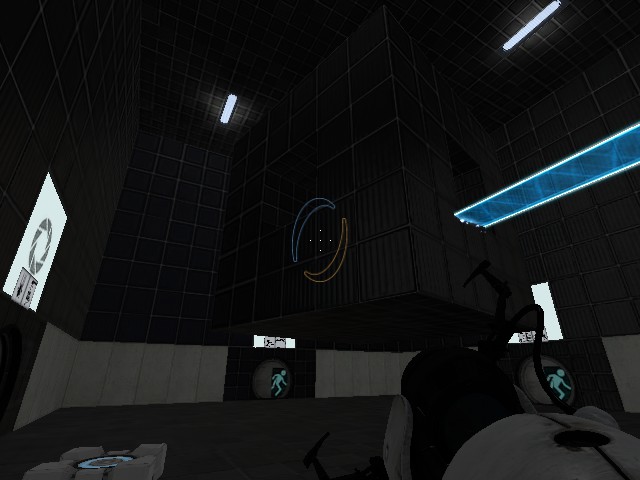
Hello, this is my first post. These are some images of a mod I'm working on.Entrance isn't in there yet. Opinions?
Those were some damn nice pictures  Since it is Wheatleys broken theme, why not guide the player from the elevator to a not-working-door, then open panels in the wall and bam, the player will be in the room
beecake wrote:
Bayleaf wrote:Hello, this is my first post. These are some images of a mod I'm working on.
Entrance isn't in there yet. Opinions?
Those were some damn nice pictures
Actually, it's not Wheatley broken test chambers, it's actually for parts later in my mod. I wanted to start out with some mostly pristine chambers, and as the player progresses further the chambers start to open up. Here's an example of an early chamber:
![[Image]](http://i.imgur.com/nJorT.jpg)
http://www.youtube.com/watch?v=_zur1XXB ... plpp_video
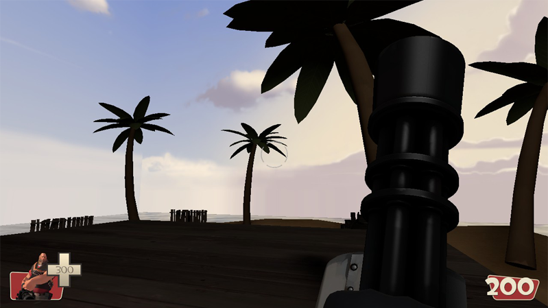
A map i really hope i will finish
&&&
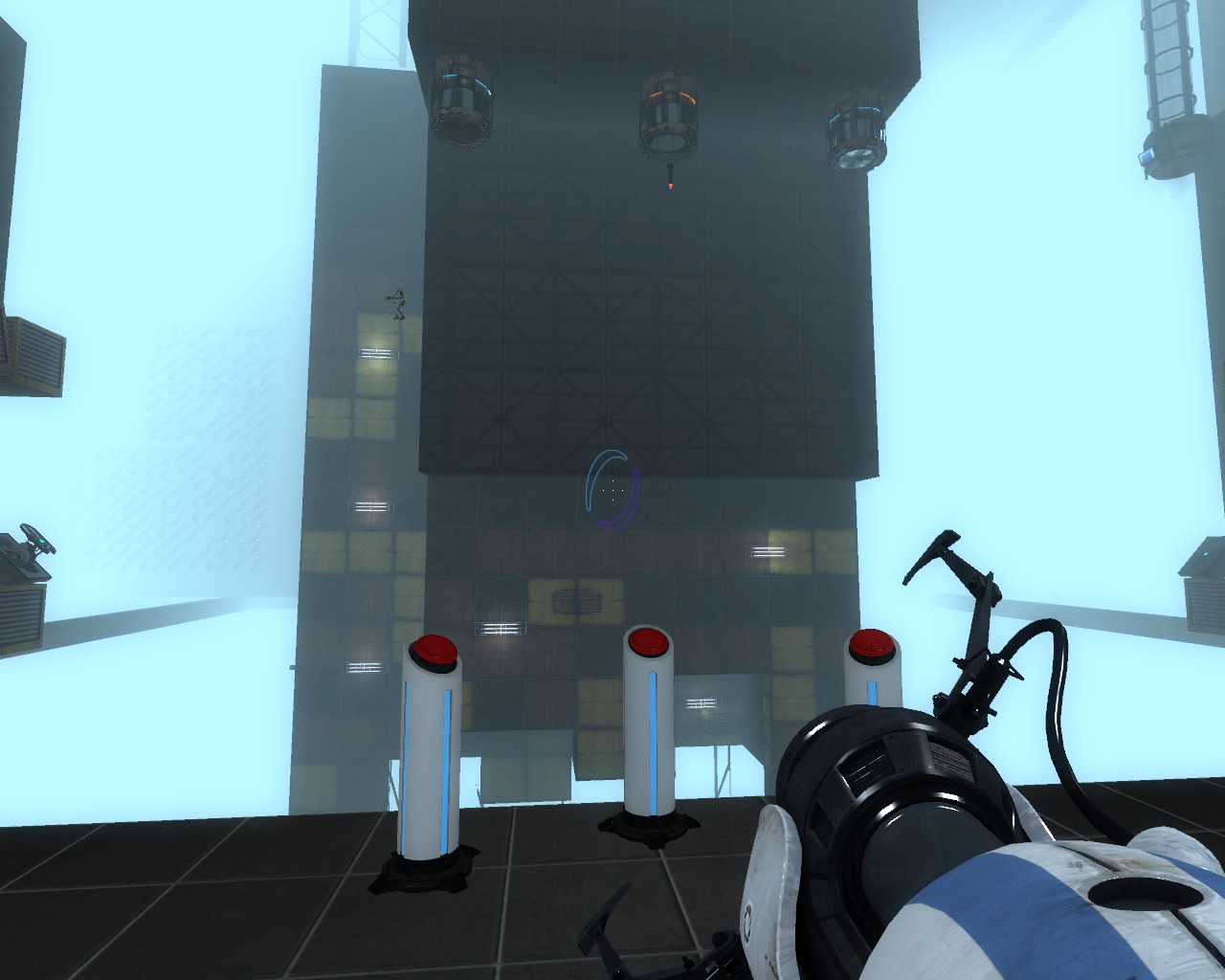
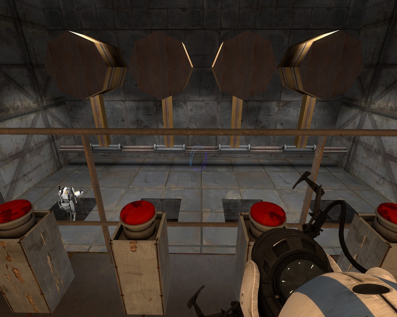
 Okay, seriously, I'm making a map with a giant floating cube in the middle that the player must open using weighted cubes on cube_buttons.
2012-03-06_00001.jpg
2012-03-06_00002.jpg
2012-03-06_00003.jpg
Okay, seriously, I'm making a map with a giant floating cube in the middle that the player must open using weighted cubes on cube_buttons.
2012-03-06_00001.jpg
2012-03-06_00002.jpg
2012-03-06_00003.jpg
Edit: BTW Beecake, I saw your video and I couldn't stop laughing after seeing "You got problems... MONSTER!"
MasterLagger wrote:
Edit: BTW Beecake, I saw your video and I couldn't stop laughing after seeing "You got problems... MONSTER!"
Haha! Thank you... I like horror 
If you're really picky about the details you could also say the stairs are a bit too much of big blocks to have your map look Valve-tier, it's not Minecraft after all.
I think some underinformed players will die after they walk up the stairs in the second screenshot
dinnesch wrote:
Looks fine, except for the side textures of the white panels which just look weird.
Is this kind of texture more appropriate? [I think valve use this in their button instances.]
BEARD! wrote:
Is this kind of texture more appropriate? [I think valve use this in their button instances.]
I think that would be a little better. I usually use that texture for the sides of white panels, and the dark texture in your earlier screens for thin metal panels.
Also, that white metal you used for the excursion funnels strike me as out of place.
All else is looking okay.

First official screenshot from my first ever map in Hammer...
This is the first room. Lighting and detail hasn't even started yet, most of the stuff there is just conceptual and will (hopefully) look a lot more awesome on release.

could you maybe upload the file?
Whack-O-Mole and Rocket Droppers
Kaleido wrote:
I suppose I should post this here, not leave it buried in my help thread:First official screenshot from my first ever map in Hammer...
This is the first room. Lighting and detail hasn't even started yet, most of the stuff there is just conceptual and will (hopefully) look a lot more awesome on release.
Looks good but the open sky seems out-of-place for Portal. Not that variating is bad, but for the "humble" art of story-less mapping it usually gives the best result to stick to a game's setting.
And you bunch of lazy shits should indeed play The Amazing Race, that map deserves some love.
CamBen wrote:
where did you get the skybox? I didn't find any in the downloads section or the portal 2 directory.could you maybe upload the file?
It was me who prepare the files for Kaleido, and I posted the files already. Find them in this thread:
http://forums.thinking.withportals.com/post67613.html#p67613
Anyway, I think you should not simply use the same one as Kaleido is already working with it, and it's not so difficult to pick some other skyboxes and inmplement them in Portal2. If you are interested in any specific one, just pm me and I'll help you about that, ok?

sorry.