The ThinkingWithPortals Map Showcasing Thread
Robdon wrote:
ThanksYes, I'm working on the lighting at the moment, as I'm not happy with it... Probably the hardest bit I think.
I think the map could use some natural light from the destroyed ceiling with some artificial lights mixed in.

aborttrap wrote:
This is my first attempt at a full-on map for Portal 2 (or the Source engine for that matter!), and let me simply say that I've been loving it the further you get into it
Looks fantastic so far for your first map!
The only thing that is bothering me is that dull-warmish-neutral looking light. Would it look better if it was cool? Perhaps a bit of color variance is what it needs.
Marlovious wrote:
Looks good robdon, might be a little bright for a destroyed map though.
Ok, here they are again, but with darker lighting, and with fog and shadowing added...
Better?
Its amazing how much 'atmosphere' it can change by just adding these 
Only problem is, its hard to get a balance between light/dark. Depending on if I do it in the daytime or later at night, and get something that works for both real life lighting/play times.
Click to enlarge:
Click to enlarge:
Click to enlarge:

Also, I discovered that even if your computer runs horribly on the high settings--as mine does--if you set AA to 16X and set all the effects, shaders, etc. to high and then build the cubemaps it looks awesome.
Click to enlarge (full resolution 1280x800):


WIP. Comments?

Also WIP. Different map.
chickenmobile wrote:
aborttrap wrote:This is my first attempt at a full-on map for Portal 2 (or the Source engine for that matter!), and let me simply say that I've been loving it the further you get into it
Looks fantastic so far for your first map!
The only thing that is bothering me is that dull-warmish-neutral looking light. Would it look better if it was cool? Perhaps a bit of color variance is what it needs.
Thanks! And yeah, the light next to the gel was originally cool-coloured but I forgot to change it later on.
@ Robdon: It looks a lot better with the fog - now you've got a really nice balance between the warm and cool tones
@ WinstonSmith: Looking great, but maybe there's too much variation between light and dark tiles? IMO, I think it distracts from the overall look of the puzzle.
@ Groxkiller: Both shots look very Valve-like. In the first picture, are you planning to expand the roof area? Maybe the wall texture in the top-right looks a little bare. Second map looks excellent!
aborttrap wrote:
@ WinstonSmith: Looking great, but maybe there's too much variation between light and dark tiles? IMO, I think it distracts from the overall look of the puzzle.
Thanks, I appreciate the feedback. I made the walls as busy as they are because I'm constantly on my guard to make sure that the chamber environment isn't boring. I suppose that could lead to making it too distracting.
aborttrap wrote:
@ Groxkiller: Both shots look very Valve-like. In the first picture, are you planning to expand the roof area? Maybe the wall texture in the top-right looks a little bare. Second map looks excellent!
True. I'll look into adding some scaffolding or trusses up there. Thanks for the feedback!
(By the way, all of your Portal 2 screens look amazing! I can't wait starting on a Portal 2 map after this one is done.)
clicky ==>


Keep up the unbelievably awesome work.
(Keep in mind, ladies and gentlemen, that he's doing this without instances.)


Apart from that tho it's very nice mapping.
HMW wrote:
Thanks! I do feel kind of lonely being probably the last guy on the planet who's mapping for Portal 1, but I've put so much time into this map already, it would be a shame not to finish it
Portal 1 FOREVER! Your map looks amazing!
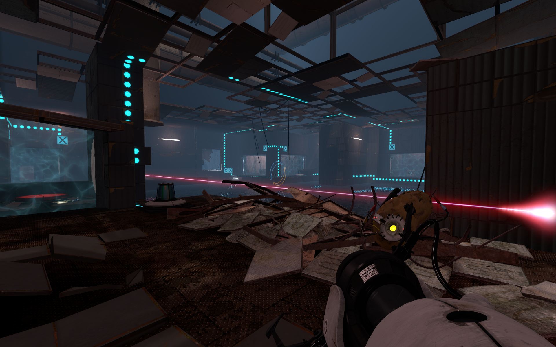
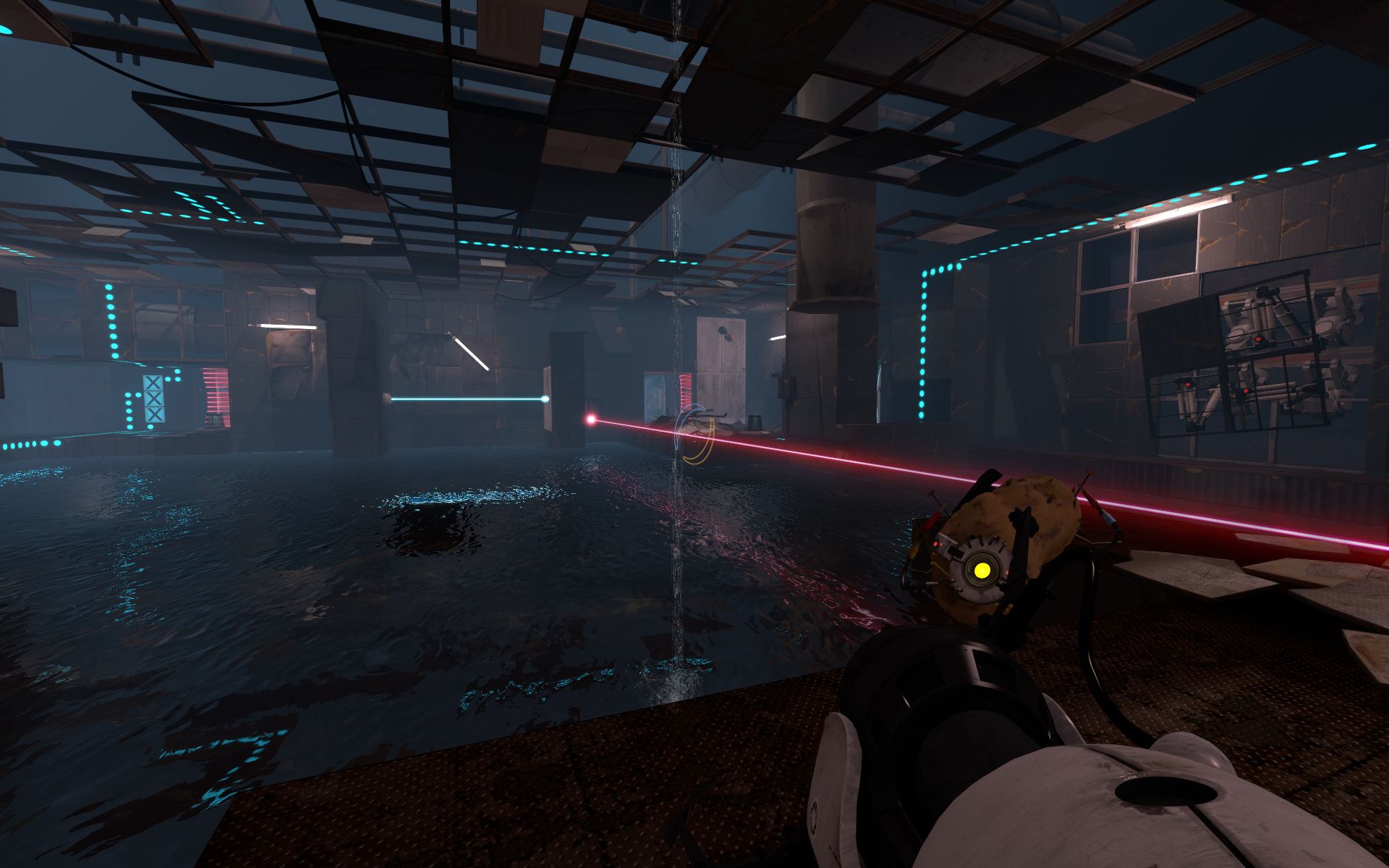
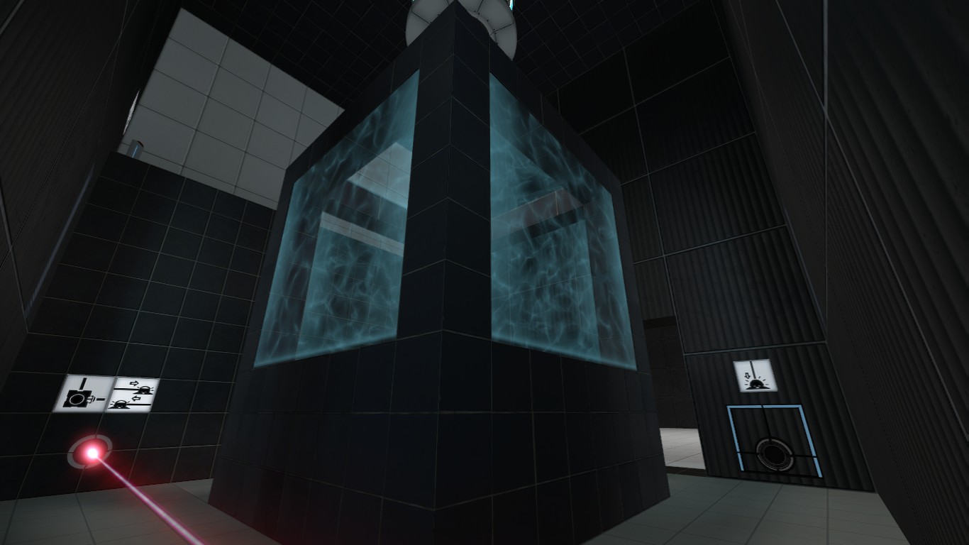
This is just a couple of shots from a current map I'm working on. The shots are from just one of the rooms you need to complete.
If anyone could give me some tips on lighting...that would be great. =]
2011-07-20_00001.jpg 2011-07-20_00002.jpg
Lostprophetpunk wrote:
If anyone could give me some tips on lighting...that would be great. =]
I'm still starting out with P2 mapping but I found that a good starting point is to add an observation room instance plus env_projectedtexture light. (Look at "sp_a2_column_blocker.vmf" for an example.)
Also there are a lot of instances available of the light strips behind glass. ("instances/lights/light_panel_*"). These work well to fill in dark areas of a room, especially with the black, clean style you're using.
HMW wrote:
I'm still starting out with P2 mapping but I found that a good starting point is to add an observation room instance plus env_projectedtexture light. (Look at "sp_a2_column_blocker.vmf" for an example.)Also there are a lot of instances available of the light strips behind glass. ("instances/lights/light_panel_*"). These work well to fill in dark areas of a room, especially with the black, clean style you're using.
Thanks so much. =] This will be very helpful in the completion of my map. (still have a lot to do).
I appreciate the feedback very much.