The ThinkingWithPortals Map Showcasing Thread

iWork925 wrote:
I know its a WIP, but could you possibly jam any more misaligned textures in there?
Yes.

....iiiin the hospital. Yeauh...
Although I do enjoy looking at all these pics you guys are putting up. Gives me some inspiration.


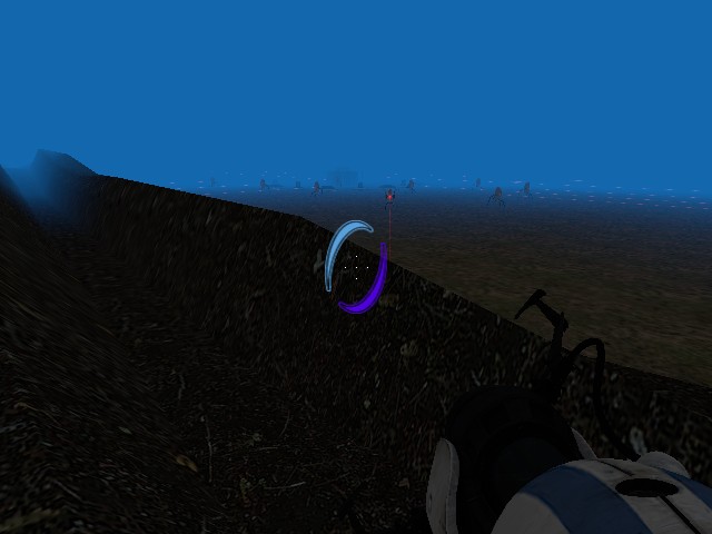
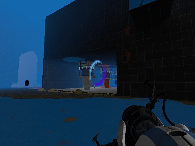
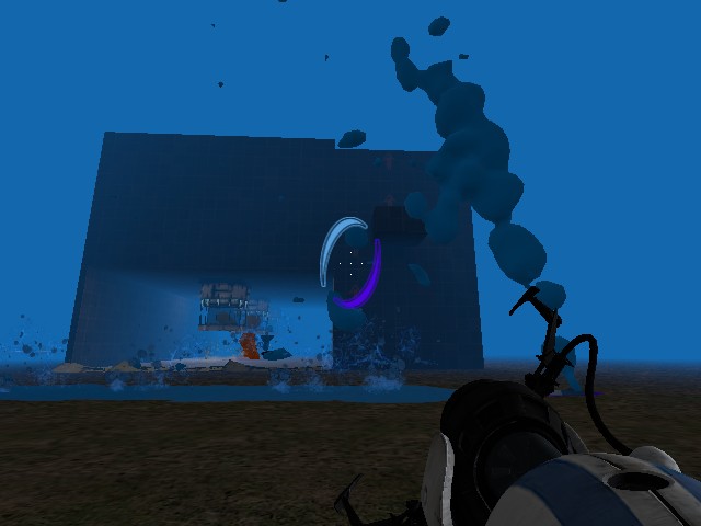
The start of the Portal campaign was eye-candy... honestly I don't think that there is enough puzzles without only the blue portal gun... I challenge someone to make a good one Portal-Portal Gun map!
The only thing I can point out is the computer on and the desk is too neat. Make the monitor fallen on the table sideways or something.

I think it's very close to completion, but it still needs to be tested as currently I'm the only one who's played it!
Still polishing it up a bit and putting some final touches to it. I'm hoping to release it pretty soon.
- The chamber itself is very large and has no white space whatsoever (other than on the targets you are meant to put the portals), thus making it look very bland. Obviously I know it is clean theme, however try putting Observation rooms or white space in places that will not make the chamber 'cheatable'. Increasing white space also makes the puzzle not so obvious and can give the player a 'aha' moment.- There is a model that encases glass, I can see that your glass does not have this. Try looking for 'frame' in the model viewer.- Lighting is a must. Your chamber looks almost full bright (unless it is) and the lights you have put in don't seem to cast any light. Copy and paste lights from Valve's example SDK maps, they will help.
Other than that, well done. My first map in hammer was incredibly bad.
chickenmobile wrote:
Shawy I have to point out a few major things from this screen shot:
- The chamber itself is very large and has no white space whatsoever (other than on the targets you are meant to put the portals), thus making it look very bland. Obviously I know it is clean theme, however try putting Observation rooms or white space in places that will not make the chamber 'cheatable'. Increasing white space also makes the puzzle not so obvious and can give the player a 'aha' moment.- There is a model that encases glass, I can see that your glass does not have this. Try looking for 'frame' in the model viewer.- Lighting is a must. Your chamber looks almost full bright (unless it is) and the lights you have put in don't seem to cast any light. Copy and paste lights from Valve's example SDK maps, they will help.
Other than that, well done. My first map in hammer was incredibly bad.
Thanks for the comment, I need a lot of feedback.
About the lack of white surfaces, I've done that intentionally because I think the puzzle is actually pretty difficult and even with only having the bare minimum of surfaces to portal, it's not actually obvious at all what you need to do with them. As for the observation room, this screen was bascially taken FROM the observation room, so I have one on the wall directly behind where the photo was taken.
The map is not fullbright, it has light entities and the lights on the walls and roof are not just for aesthetics, they do in fact cast light, I used the func_instances for all my lights.
iWork925 and xidesp have been testing it for me (though the photo was taken when only I had played the map) and are being helpful with things that I need to change. If you're up for it, I'd love to send you the map and you could also help me test it. Hopefully then you'll see what I mean about the puzzle not being obvious.
Once I've polished up the major issues I'll release it as a WIP and see if there are any other issues that need addressing.
Thanks. I also like the first part of the game, even though it's the easiest part
MrLate wrote:
New project, finally!
A couple things that you might be aware of already:
-There should be more destruction around the missing panels. It seems too clean at the moment.
-The top platform with the floor button on it seems a little thin to me. Maybe make it a bit thicker or add some supports or something (more of a personal opinion).
appunxintator wrote:
MrLate wrote:New project, finally!
A couple things that you might be aware of already:
-There should be more destruction around the missing panels. It seems too clean at the moment.
-The top platform with the floor button on it seems a little thin to me. Maybe make it a bit thicker or add some supports or something (more of a personal opinion).
I agree with the first point but on the other hand I think the thinner platform looks fine. Also, I will say that I love the lights on the left-hand side of the second shot; they give the room a very window-lit-esque feeling.

Any pointers or praise would be appreciated 
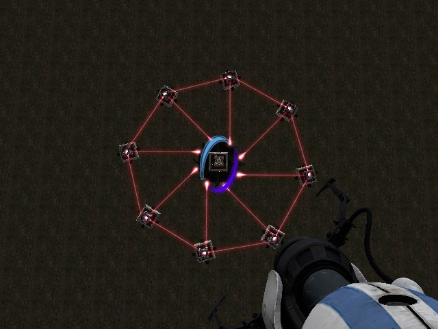
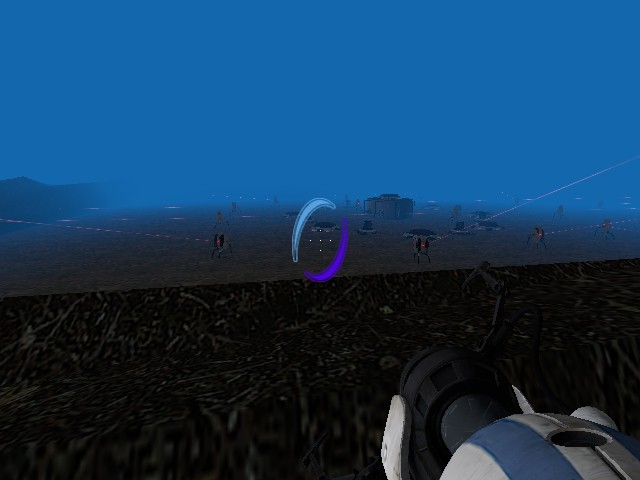
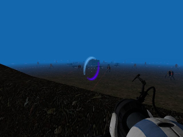
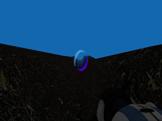
yohoat9 wrote:
I'm one of those people who misses Portal 1 mapping, so this is what I'm working on at the moment.Any pointers or praise would be appreciated
Wouldn't the lasers pointed at the laser cube create an infinite loop that would eventually melt the cube from too much laser?
chickenmobile wrote:
yohoat9 wrote:I'm one of those people who misses Portal 1 mapping, so this is what I'm working on at the moment.
Any pointers or praise would be appreciated
Wouldn't the lasers pointed at the laser cube create an infinite loop that would eventually melt the cube from too much laser?
Don't think too much 
But really people I want some feedback that'll decide if I do a whole project of this or not.